A Simple Shopping Decision
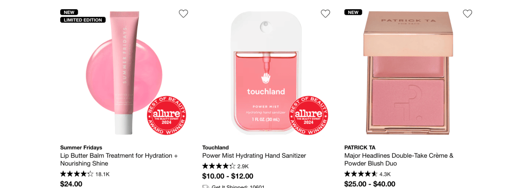
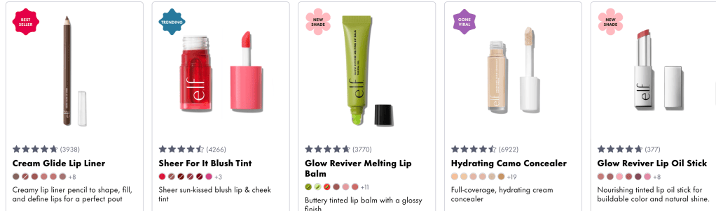
Imagine opening a eauty website because you need a new lip product. At first, the decision seems simple. Then you see dozens of shades, customer ratings, sale prices, limited-edition labels, and messages saying that certain products are almost gone. One item is marked “Bestseller,” while another is already selected as the recommended option. Before you realize it, the website has helped determine what you notice, compare, and eventually purchase.
This is where behavioral economics becomes important to design. Traditional economics often assumes that people carefully compare every option and make the most logical decision. In reality, people are affected by emotion, habits, time pressure, visual cues, and the way choices are presented. Behavioral economics studies these influences. Designers can use that knowledge to make decisions easier, but they can also use it to push people toward choices they may not have made on their own.
When Too Many Choices Become a Problem
One way behavioral economics appears in design through choice architecture, which is the way options are organized and presented. A website may technically allow customers to choose from hundreds of products, but it rarely displays every option with equal importance. Instead, it uses categories, filters, recommendations, and featured products to make the decision feel more manageable.
This connects to perception and cognition because people cannot give equal attention to everything on a crowded screen. Color, size, placement, and contrast influence what we notice first. A large “Add to Bag” button will probably receive more attention than a small gray link underneath it.
This also connects to affordances, or the visual qualities that suggest how an object can be used. According to the Interaction Design Foundation, affordances help users recognize the actions available to them. A button that looks clickable tells someone what to do without requiring a long explanation. Interaction Design Foundation
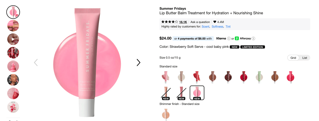
An “Addt to Bag” button is an affordance, but its placement is also part of the choice architecture. When it appears beside a recommended shade, strong reviews, and free-shipping information, the whole layout gently directs the customer toward completing the purchase.
Choice architecture can be helpful. Filters for shade, price, finish, or skin type save customers from searching through every product. However, the same principle can become frustrating when a website gives one option much more attention than the others or makes the company’s preferred choice easier to select.
Why We Trust What Other People Choose
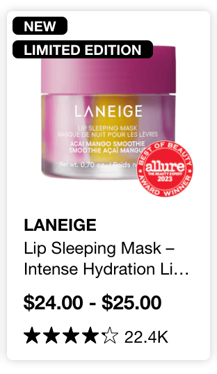
After narrowing down the options, a customer may still be unsure which product to buy. This is when social proof can influence the decision. Ratings, reviews, award badges, customer photographs, and labels such as “Bestseller” suggest that other people have already approved of the product.
Bridgeable explains that behavioral economics helps designers understand how people actually make decisions, including the mental shortcuts that influence their behavior. Bridgeable When people feel uncertain, the behavior of others can become one of those shortcuts. A product with thousands of positive reviews may feel safer than one with no reviews, even if the customer has not compared their ingredients or quality.
Social media adds another layer to this principle. A beauty product may become more desirable after it goes viral on TikTok, sells out, or appears in multiple influencer videos. When that popularity is repeated on the product page through ratings and customer content, the item feels familiar before the customer has even tried it.
This does not mean reviews are unhelpful. Real customer experiences can provide useful information about a shade, fit, or formula. The problem begins when a design creates pressure instead of providing honest information.
The Fear of Missing Out
Once a customer becomes interested in a product, loss aversion can encourage them to act quickly. Psychologist Daniel Kahneman’s research showed that people often experience the pain of a loss more strongly than the pleasure of an equal gain. His work connected psychology with economic decision-making and earned him the 2002 Nobel Prixe in Economic Sciences. Nobel Prize
Online, loss aversion appears through messages such as “Only two left,” “Sale ends tonight,” or “Your cart is about to expire.” These messages change the customer’s focus. Instead of asking whether they truly want the item, they may start worrying that they will lose the chance to buy it.
A countdown can be useful when a sale really has a clear ending. An inventory warning can also help customers understand that a product is nearly sold out. However, a fake countdown that restarts whenever the page is refreshed creates urgency without giving the customer truthful information. At that point, behavioral design becomes manipulation.
When Guidance Becomes Manipulation
The shopping experience changes once we recognize that a website is not simply displaying information. It is arranging that information to encourage a particular behavior.
This influence is not automatically wrong. Good design should help people understand their options and complete a task without unnecessary confusion. Clear buttons, useful recommendations, honest reviews, and organized categories can reduce the amount of mental effort a decision requires. The Behavioural Insights Team applies research about human behavior to interventions intended to solve real-world problems. Behavioural Insights Team
The ethical question is whether a design supports the user’s goal or only the company’s goal. The Federal Trade Comission uses the term dark patterns to describe digital design practices that can trick or manipulate people into making decisions. These practices may include hiding addtional charges until checkout, making a subscription easy to begin but difficult to cancel, or using confusing buttons that cause someone to agree unintentionally. Federal Trade Commission
A helpful design makes important information easy to see. A manipulative design hides that information while making the company’s preferred sction stand out.
Designing Choices People Can Trust
By the end of the shopping experience, a customer may feel as if they independently selected a product. They did make the final choice, but the design shaped the path that led to it. It determined which products appeared first, which button stood out, which reviews were visible, and whether the customer felt calm or rushed.
For social media managers andcontent creators, this matters because every visual decision can affect behavior. Choosing a color, label, photograph, button, or call to action is not only about making content attractive. It can also influence what the audience notices, believes, and does next.
Behavioral economics can make design clearer and more useful when it helps people make informed decisions. It becomes harmful when it depends on confusion, hidden infomration, or unnecessary pressure. The strongest design does not take freedsom away from the user. It presents choices clearly enough for people to understand what is happening and feel confident about the decisions they make.
Sources
- Bridgeable. “The Top 5 Behavioural Economics Principles for Designers”
- Interaction Design Foundation. “Affordances”
- Nobel Prize. “Daniel Kahneman—Facts”
- Behavioural Insights Team
- Federal Trade Commission. “Bringing Dark Patterns to Light”
 The Dark Edit
Leave a comment