When I started this project, I didn’t just want to redesign a brand; I wanted to rethink how trust is communicated visually. For my final project, I focused on Rinaldi Electric, a local, family-owned electrical company with a strong reputation built on reliability and relationships. The challenge wasn’t to fix something broken, but to elevate something that already works.
This project pushed me to think like both a designer and a strategist. Instead of jumping straight into visuals, I started by asking: What does this brand need to say before it even speaks?
Understanding the Brand First
Rinaldi Electric is built on trust, responsiveness, and long-term customer relationships. That became the foundation of every design decision I made. The goal of this redesign was to create a brand that:
- Feels more modern and professional
- Builds trust instantly with homeowners
- Works consistently across web, print, and service materials
As shown in my deck, this wasn’t about changing the identity completely; it was about strengthening how that trust is visually communicated.
Research That Shaped My Direction
One of the most important parts of this project was analyzing competitors. When I looked at companies like Keating Electric, Consolidated Hudson Electric, and Norco Electric, I noticed something interesting: they all focused heavily on function, but very little on brand identity.
This created a huge opportunity.
Most competitor websites were clean and informative, but visually generic. That insight directly influenced my approach. I wanted Rinaldi Electric to feel more refined and memorable without losing its professionalism.
I also researched typography trends in the industry and found that clean sans-serif fonts dominate. Instead of blindly following that, I intentionally paired Montserrat and Open Sans to balance strong headlines with readability.
Building a Cohesive Visual System
From there, everything became about consistency.
I developed a full visual system including:
- A structured type hierarchy
- A cohesive color palette (navy, white, electric blue, and safety accents)
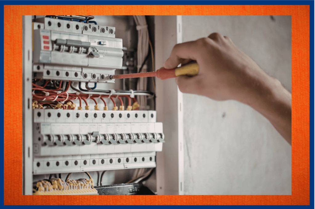
- Real, professional photography to build credibility
- A refined logo approach that keeps brand recognition while improving presentation
The color palette was especially important to me. Navy communicates trust and professionalism, while accent colors like electric blue and safety yellow create subtle moments of emphasis without overwhelming the design.
Applying the Brand in Real Life
What really brought this project together was applying the brand across real materials. Instead of just designing a logo, I created a full identity system including:
- Business cards and vehicle decals
- Website mockups with clear calls to action
- An event poster focused on readability and hierarchy
- A brochure with a structured, easy-to-follow layout
- A newsletter to reinforce long-term brand consistency
Each piece was designed with the same goal: to make information easy to understand while reinforcing trust at every touchpoint.
What I Took Away From This Project
This project changed how I think about design.
Before this, I saw branding as mostly visual. Now, I see it as a system, one that combines strategy, psychology, and design to create a clear experience. Every choice I made had to answer a bigger question: Does this make the brand feel more trustworthy?
In the end, this redesign isn’t just about looking better. It’s about feeling more credible, more modern, and more consistent across every interaction.


Leave a Reply