Before this module, I honestly thought good design just meant making something “look nice.” If it felt balanced and aesthetically pleasing, I assumed I was doing it right. But after diving into grids, wireframes, and mockups, I realized something important: the best designs aren’t just pretty, they’re intentional.
This week completely shifted how I approach visual design. Instead of starting with colors or fonts, I now start with structure.
The Moment It Clicked for Me
When I started working on my Rinaldi Electric website and newsletter, I initially jumped straight into designing the final version. I wanted it to look clean, modern, and professional. But I kept running into the same problem, that something always felt slightly “off,” even if I couldn’t explain why.
Once I stepped back and created wireframes first, everything changed.
Using a grid forced me to think more logically:
- Where does the user’s eye go first?
- What information matters most?
- How do I guide someone through the page without overwhelming them?
It made me realize that design isn’t just about visuals, but it’s about communication.
Why Grids Actually Matter
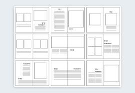
Grids are one of those things that feel invisible when they’re done well, but obvious when they’re not.
After researching different layouts and real-world examples, I noticed that almost every professional website or newsletter uses some form of grid system. It’s what keeps everything aligned, consistent, and easy to follow.
For my projects, I kept things simple:
- A strong hero section at the top
- Clean, stacked sections underneath
- A clear call-to-action at the bottom
This structure helped me create designs that feel organized without looking boring.
From Wireframes to Final Design
One of the biggest takeaways for me was understanding the difference between wireframes and comps.
At first, wireframes felt unnecessary. They’re not visually exciting, and honestly, they’re just boxes and placeholders. But now I see them as the most important step in the process.
Wireframes allowed me to:
- Focus on layout without distractions
- Experiment quickly with different structures
- Fix problems before committing to design
By the time I moved into my final comps, everything felt easier. I wasn’t guessing anymore; instead, I was building on a solid foundation.
Designing With the User in Mind
Something I kept thinking about throughout this process is how real people interact with design.
For example, if someone is looking for an electrician, they don’t want to search around a complicated website. They want:
- Clear services
- Easy contact information
- A sense of trust
That’s why I focused on making my layouts simple and direct. Every section had a purpose, and every element supported that purpose.
This is something I want to carry into my future work, especially as I continue pursuing social media and digital marketing. Design isn’t just about creativity; it’s about creating experiences that make sense.
Final Thoughts
This module helped me move from designing based on instinct to designing with intention. For my website, it was tricky navigating at first, but once I started the newsletter, the grids truly helped.
Grids, wireframes, and mockups might seem like technical steps, but they completely change the outcome of a project. They make designs stronger, clearer, and more effective.
Going forward, I know I won’t skip these steps again. If anything, they make the creative process feel more controlled and, honestly, more enjoyable.
Because once the structure is there, everything else just falls into place.


Leave a Reply