
When most people think about design, they usually notice the colors, fonts, or images first. While those details are important, one of the most powerful design tools is hierarchy. Hierarchy in layout is what helps guide the viewer’s eye and makes information easier to understand. Without it, even a visually appealing design can feel cluttered and confusing.
Hierarchy is the arrangement of elements according to their importance. Designers use size, spacing, contrast, alignment, and typography to show viewers what to look at first, second, and third. It creates order and makes content feel intentional instead of random.
What Hierarchy Looks Like in Everyday Life
We interact with hierarchy constantly, even if we do not realize it. When we open an app, visit a website, or look at a social media post, hierarchy is already directing our attention. Headlines are larger than body text. Buttons use bright colors. Important information is placed near the top.
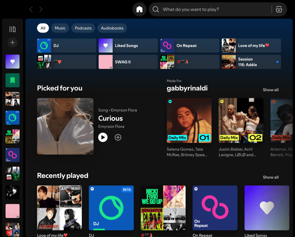
These choices are strategic. They help users move through information quickly and naturally.
Why It Matters in Posters and Advertising
Hierarchy becomes especially important in posters and promotional design. A viewer should immediately understand what they are looking at within seconds. The most important information needs to stand out first.
For example, in a movie poster, the title is often the largest element because it needs instant attention. Supporting details such as actor names, taglines, and release dates are smaller because they are secondary.

This week’s project helped me understand how hierarchy can create mood while still organizing information. The title grabs attention first, then the eye moves to the photos, and then to the smaller details at the bottom.
Applying Hierarchy to Brand Design
I also saw hierarchy while creating event posters for Rinaldi Electric. In that design, viewers need to know three things right away: what the event is, when it is happening, and how to respond. That means the event title should be the strongest, followed by the date and time, then the phone number or call to action.
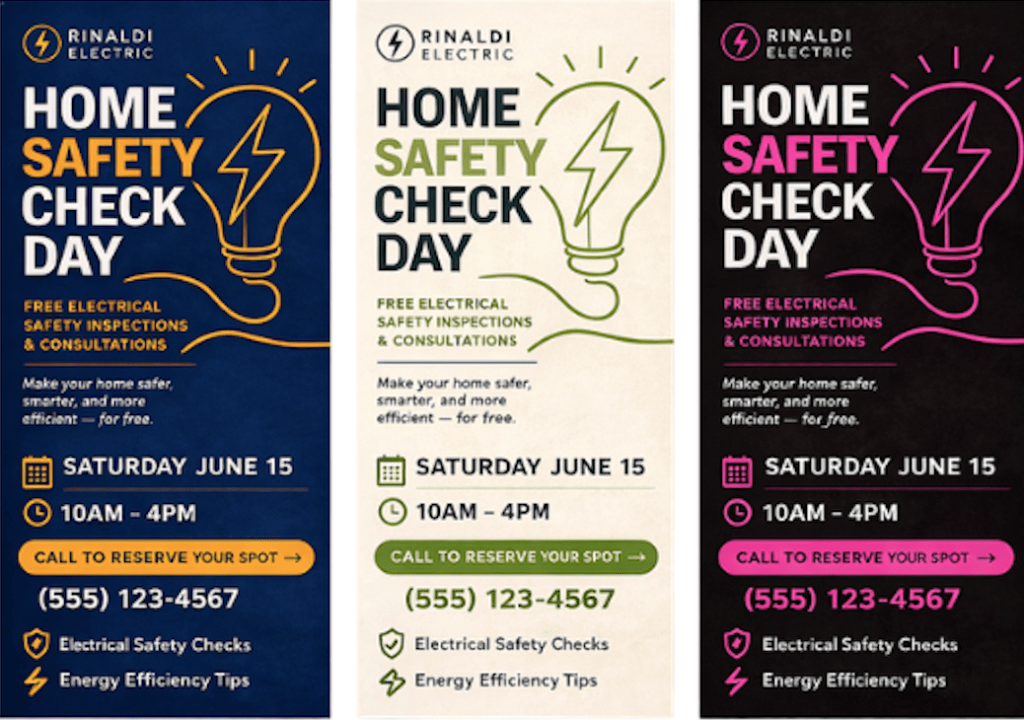
If everything is the same size or weight, nothing feels important. A good hierarchy solves that problem by creating a clear visual path.
My Biggest Takeaway
The biggest lesson I learned this week is that design is not just decoration. It is communication. Every size choice, spacing adjustment, and placement decision sends a message to the audience.
Strong hierarchy can make a brand feel polished, trustworthy, modern, or exciting. Weak hierarchy can make a design feel overwhelming or forgettable.
As someone interested in communication and branding, this topic is valuable because great ideas only work when people can understand them quickly.
Final Thoughts
The next time I see a strong ad, website, or poster, I know I will notice something different. I will pay attention to what caught my eye first, and how the designer made that happen.


Leave a Reply