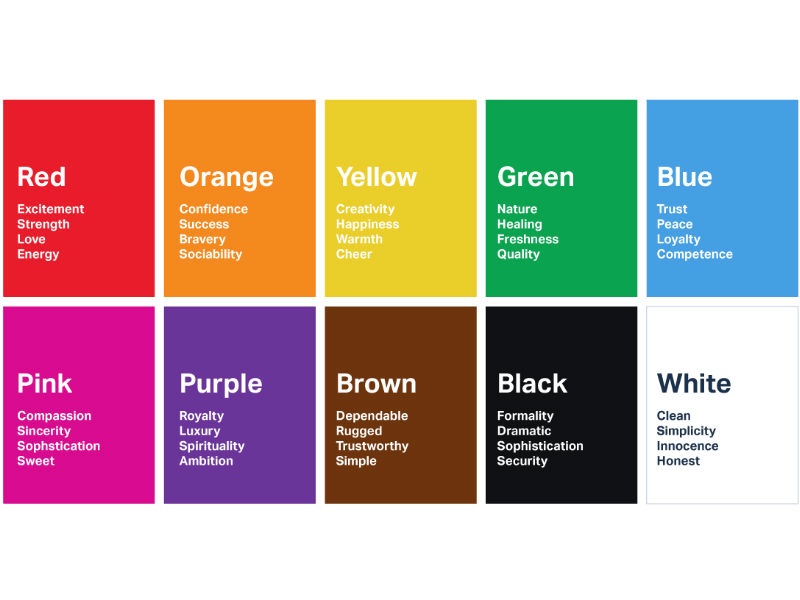
Color is something we see every day, but most of the time we don’t actually think about how much it influences us. Before this module, I honestly saw color as more of an aesthetic choice. Like something that just makes a design look “good.” But after going through the readings and applying it to my own work, I’ve started to realize that color is actually one of the most powerful tools in design.
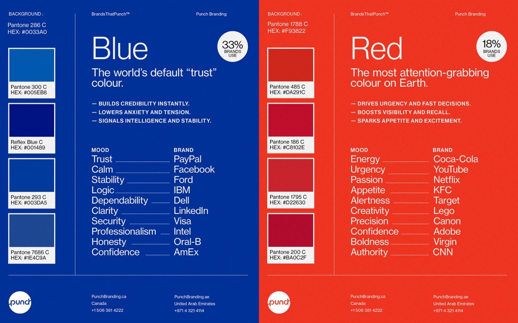
Color psychology is the idea that colors can influence how people feel, think, and even behave. What stood out to me the most is that these reactions often happen without us even realizing it. For example, certain colors like red and orange are often associated with energy, urgency, or excitement, while colors like blue and green tend to feel more calming and stable. This made me think about how often brands and designers use color intentionally to shape how we experience something.
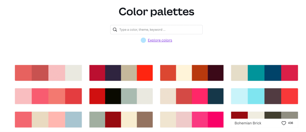
In my own project this week, I experimented with different color schemes while keeping the design exactly the same. What surprised me the most was how much the mood changed just by switching the colors. A more neutral or monochromatic palette felt clean and minimal, while a high-contrast complementary palette felt bold and attention-grabbing. Even though the layout didn’t change, the design’s feel completely shifted. That really helped me understand that color is not just decoration, it’s communication.
One idea from the readings that I found really interesting is how color can influence perception in ways that aren’t obvious. For example, color can impact how we judge things like quality, trust, or even taste. This is especially important in marketing and branding, where the goal is to create a specific emotional response. It also made me realize why consistency in color is so important, which connects to systems like Pantone that are used to standardize color across different platforms and materials.
Another thing that stood out to me is that color meaning isn’t always universal. While there are general associations, color perception can change depending on culture, age, and context. This made me think more critically about designing for different audiences and not assuming that everyone will interpret color the same way. It adds another layer of responsibility when making design decisions.
Overall, this module completely changed the way I think about color. I now see it as something that can guide attention, create emotion, and influence how a message is received. As someone interested in social media, branding, and content creation, this is especially important because color plays a huge role in how people engage with visual content. Moving forward, I want to be more intentional with my color choices, thinking beyond what looks good and focusing on what communicates the right feeling.


Leave a Reply