How Thriller Covers Make Readers Expect a Twist
The Story Starts on the Shelf
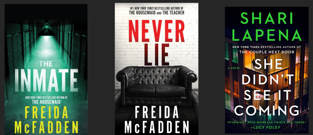
Imagine walking into a bookstore with no title in mind. A table near the entrance is crowded with new releases, yet one group announces itself before a single description is read. The covers are dark. The titles are oversized. A hallway disappears into shadow, a lonely piece of furniture sits in an empty room, and a bright accent color looks almost like a warning. Within seconds, the books feel secretive, tense, and dangerous. They look like thrillers.
That instant recognition is not an accident. A thriller cover is a small visual story built to work before the written story begins. It has to catch attention from across a store, remain understandable as a tiny online thumbnail, communicate genre, and leave enough unanswered to create curiosity. The strongest covers do all of this without explaining the plot. They make a promise about the emotional experience waiting inside.
Research supports the idea that covers shape how books are noticed and selected. Gudinavičius and Šuminas (2018) found that cover design influences reader choice, while Knowlton and Hackert (2015) found that books with publisher-supplied covers received more circulation in an academic library setting. These findings do not mean that readers ignore the author or synopsis. They show that presentation affects whether a reader pauses long enough to consider those details.
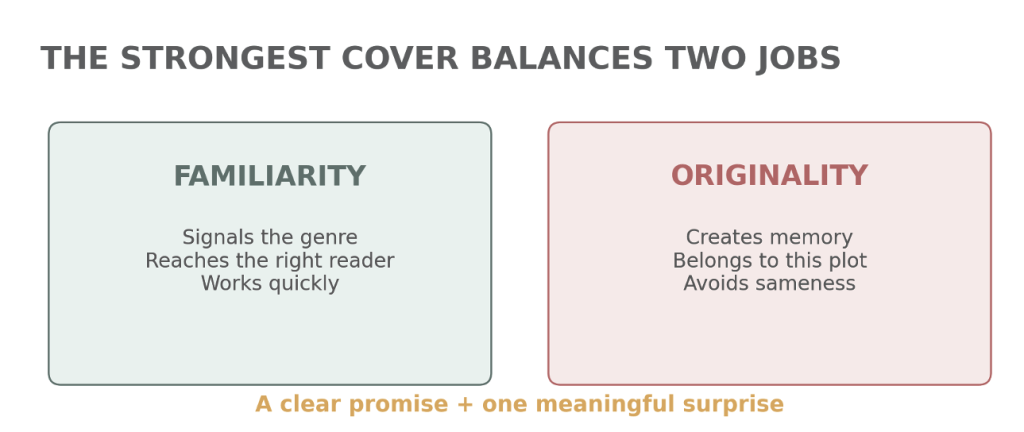
The thriller cover formula depends on a few repeated choices: bold typography, controlled color, an unsettling image, and a clear hierarchy. Repetition helps readers recognize the genre quickly. However, a cover still needs one meaningful difference that belongs to its particular story. The real design challenge is not choosing between familiarity and originality. It is using both at the same time.
The Shelf Gives Away the Genre
Visual storytelling is often described as a way of organizing information into a meaningful sequence. Gitner (2015) explains that audiences constantly interpret visual information across platforms, while Bergström (2008) connects storytelling to the relationship between words, images, and composition. A book cover compresses that relationship into one frame. It introduces a mood, hints at conflict, and gives the reader a reason to move closer.
Genre works like a shared visual language. A romance cover may use warm color, soft lighting, or two figures positioned close together. A fantasy cover may feature an invented landscape, decorative lettering, or a symbolic object. Thrillers often rely on darkness, isolation, sharp contrast, and large type. Readers may not consciously list those features, but they have seen them enough times to understand what they suggest.
That recognition matters because book shopping is fast. Covers appear beside dozens of competitors in a store and in rows of even smaller images online. Penguin Random House cover designer Anthony Ramondo explains that designers study comparable titles, target readers, and thumbnail performance as part of the process (Ramondo, n.d.). A cover is therefore judged at several distances. It must make sense across a room, in a reader’s hand, and on a phone screen.
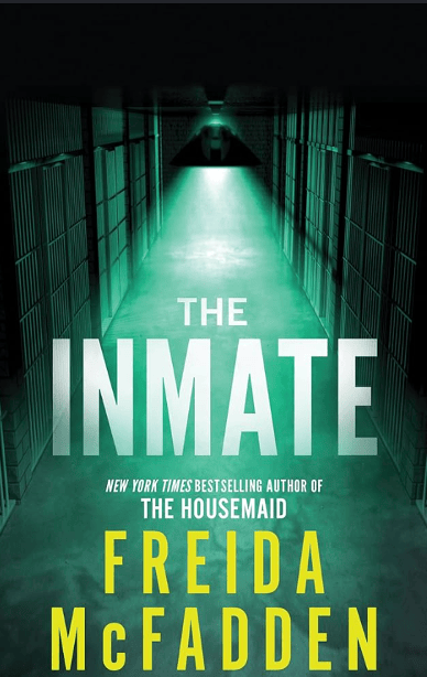
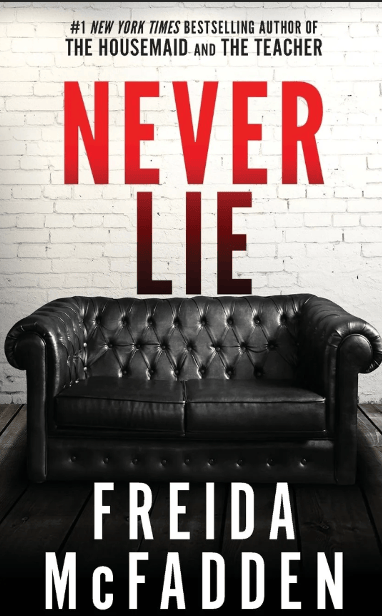
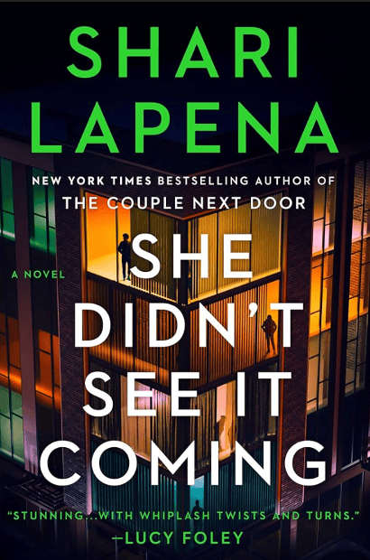
The formula can be seen clearly in three recent examples: Freida McFadden’s The Inmate, McFadden’s Never Lie, and Shari Lapena’s She Didn’t See It Coming. These books do not create the same reading experience. Never Lie moves quickly and builds toward a memorable twist, while The Inmate uses its ending to change how earlier details are understood. She Didn’t See It Coming is less surprising by comparison. Their covers still belong together visually. All three use a large title, limited color palette, strong contrast, and a setting that feels unsafe or incomplete. Together, they show how designers create variety inside a recognizable genre.
Typography That Sounds Like a Warning
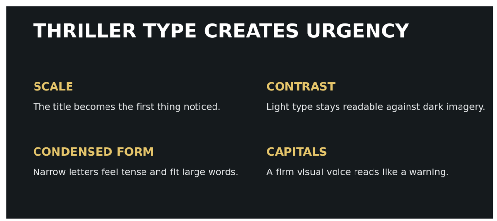
On many thriller covers, the title is not simply placed over an image. It becomes the most powerful image on the page. The letters are often tall, condensed, capitalized, and large enough to dominate the composition. This style feels direct and urgent. It also remains legible when the cover is reduced to a thumbnail.
Haraguchi, Iwana, and Uchida (2024) studied how text design helps characterize book genres. Their findings connected thriller covers with features such as condensed type and dark backgrounds. The result helps explain why so many thriller titles appear narrow, bold, and tightly arranged. The type does more than identify the book. It carries the emotional tone.
The Inmate uses a large white title against a green-blue hallway. The letters echo the narrow space behind them. The title is more visible than the distant figure, so the idea of confinement comes through before the scene is studied closely. After the ending is known, the hallway and small figure feel more deliberate because the story asks readers to rethink who can be trusted. Never Lie uses red and black type against a pale wall. The word “Lie” receives extra attention through its scale and dark color, making deception feel like the central threat. The cover is simple, but that simplicity matches a book that pulls readers forward through questions and a major final reveal. She Didn’t See It Coming uses a bright green author name above a large white title. It is noticeable, although the brighter color makes it feel slightly less tense than the other two covers.
Typography can also guide reading order. Gestalt principles help explain why. Similar letters are understood as a group, while proximity connects the title lines into one unit (Busche, n.d.). Scale establishes hierarchy, so the title is usually read before the tagline or review quote. These choices reduce confusion and allow the cover to communicate quickly.
Typeface also influences attention in measurable ways. In an eye-tracking study, Nakahata et al. (2016) found that typeface affected gaze duration and book choice in their experimental setting. The exact response to a typeface can change by reader and context, but the broader point is useful: lettering is not neutral. It affects what is noticed, how long attention remains, and what kind of personality a book seems to have.
Color Sets the Emotional Temperature
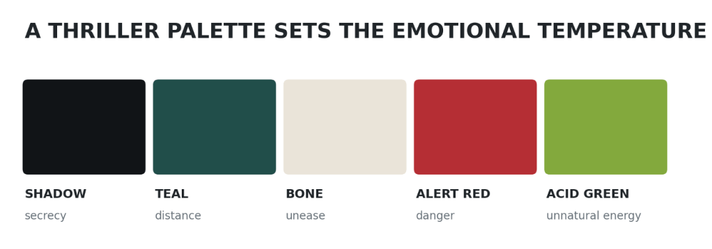
Thriller covers commonly begin with a dark base and add one sharp accent. Black, deep blue, gray, and shadowed green create an atmosphere of secrecy. Red can suggest danger, violence, or urgency. Acid yellow or green can feel unnatural, contaminated, or alerting. White often creates the strongest possible contrast for a title.
Color does not have one fixed meaning. McLeod (2023) explains that perception involves both sensory information and interpretation. Context changes what viewers believe they are seeing. A red shape on a holiday card may feel celebratory, while red lettering on a dark thriller cover can feel threatening. The surrounding image, genre expectations, and typography all help produce the meaning.
This is visible across the three covers. The cold teal-green of The Inmate makes the hallway feel institutional and emotionally distant. The red title on Never Lie immediately introduces tension against an almost colorless room. The bright green on She Didn’t See It Coming gives the cover energy, but the dark windows and evening sky keep that energy from feeling cheerful. In each case, color works with the setting rather than acting alone.
The same principle connects to emotional design. Norman (2003) describes a visceral response as the immediate feeling created by appearance. A reader may not have time to analyze why a cover feels tense. Contrast, darkness, and color can create that reaction first. Behavioral and reflective responses follow when the reader picks up the book, reads the description, recognizes an author, or connects the cover to earlier reading experiences.
The most effective palette is therefore not the darkest one. It is the palette that supports the story and remains distinct beside similar books. If every thriller uses the same black background and red title, the signal becomes easy to recognize but harder to remember. One unexpected color can preserve the genre cue while giving the book its own identity.
The Threat Is Often Implied
Thriller covers rarely show the entire danger. Instead, they offer one fragment: a locked door, a distant figure, a house at night, a staircase, an empty chair, or an object that seems ordinary until the reader understands its role. This restraint is important because suspense depends on missing information.
Lupton (2017) explains that design can shape a narrative through action, emotion, and sensation. A cover cannot deliver a complete plot arc, but it can begin one. It presents a visual situation and encourages the viewer to ask what happened before and what might happen next. The unanswered question becomes part of the appeal.
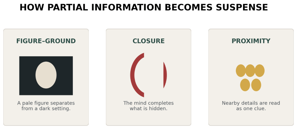
Gestalt theory helps explain why partial information can still feel complete. Closure allows viewers to mentally finish an incomplete form, while figure-ground separation makes one subject stand out from its setting (Busche, n.d.). Thriller covers use the same habits of perception. A silhouette does not need facial detail to be understood as a person. A dark opening can read as a threat even when nothing is visible inside it. The mind fills the gap, and the imagined danger may be more personal than a fully shown scene.
Never Lie is a good example. The black couch and white brick wall look simple, but the emptiness feels suspicious. The scene does not reveal a crime. It makes the reader wonder who should be in the room and why the space was left empty. That question fits a story built around secrets. The Inmate uses a distant figure at the end of a narrow passage. Because the figure is small and unclear, the hallway becomes almost as important as the person. She Didn’t See It Coming presents a residential space that should feel safe, but darkness and separation turn it into a place of uncertainty. The image communicates the genre clearly, even if its visual clue is not as memorable as the empty couch on Never Lie.
Reedsy’s collection of thriller cover examples shows how often designers rely on isolated architecture, obscured people, and symbolic objects (Reedsy, n.d.). These repeated images are useful because they suggest danger without spoiling a twist. The image acts as evidence, but the reader still has to decide what it means.
Why Familiarity Works
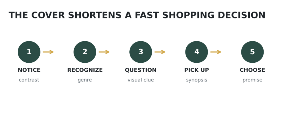
The repeated thriller formula may seem predictable, but familiarity has practical value. Readers make fast decisions, especially when many options appear at once. Behavioral economics examines how people use mental shortcuts instead of carefully evaluating every detail. Bridgeable (n.d.) identifies principles such as framing, social proof, and choice architecture that influence decisions. A genre cover works as a form of framing. Before a synopsis is read, the design tells the shopper what kind of experience is being offered.
This shortcut helps both the reader and the publisher. A reader who wants suspense can scan a shelf and eliminate books that do not match that goal. A publisher can position a new title beside successful comparable books. The cover becomes part of the product’s choice architecture because it helps organize a crowded market into recognizable categories.
Research on book selection shows that several factors work together. D’Astous, Colbert, and Mbarek (2006) found that reader interest in new books is influenced by features connected to the book and its presentation. Cover design is not the only reason someone chooses a title, but it participates in a larger decision that may also include author recognition, recommendations, reviews, and subject matter.
This is why comparable titles are useful during the design process. They reveal the expectations already present in the market. Ramondo (n.d.) describes using competitive research and thumbnail tests to understand where a cover belongs and whether it remains effective at a small size. The goal is not to copy a successful book. It is to make the new book recognizable to the same audience while protecting its individual story.
The process resembles a conversation. Familiar features say, “This is the kind of book you enjoy.” A distinctive clue adds, “But this story has something new.” If either side is missing, the cover becomes less effective. A completely unfamiliar design may hide the genre. A completely familiar design may disappear into the shelf.
When the Formula Becomes Too Familiar
Every visual formula has a weakness. Once a style becomes successful, it is repeated until many covers begin to look interchangeable. Bold sans-serif titles, dark domestic settings, silhouettes, and red accents can signal a thriller so clearly that the individual book loses its personality.
Monotype’s discussion of book-cover trends notes the popularity of bold sans-serif typography across contemporary publishing (Monotype, 2023). The trend is useful because it is readable and visually forceful, but trends can flatten differences between stories. A reader may correctly identify five books as thrillers and still struggle to remember which cover belonged to which plot.
The problem is not repetition by itself. Visual language depends on repetition. The problem begins when the design makes a promise the book does not keep. A cover that looks extremely violent may mislead readers if the story is mainly psychological. A cover that resembles a domestic thriller may disappoint someone expecting a police procedural. Attraction without accuracy can create the wrong audience.
Book designer Peter Mendelsund has argued that a successful cover should not merely illustrate the book. It should create a visual idea that can stand beside it (Wired, 2014). That approach offers a way out of sameness. Instead of adding every familiar thriller symbol, the designer can identify one detail that matters to this story and build the cover around it.
Among the three examples, She Didn’t See It Coming pushes the formula furthest through its bright green author name and layered architectural image. It still reads as suspense because of the darkness, scale, and title treatment. However, the cover may be easier to notice than to remember because its central clue is not immediately clear. Never Lie succeeds through extreme simplicity. The empty couch is quieter than a running figure or bloody object, which makes the absence itself memorable. It also gains meaning after the story is finished. The cover does not reveal the twist, but it feels more connected to the book once the reader knows what happened.
Designing a Cover That Keeps Its Promise
A useful thriller-cover process can be organized around five questions.
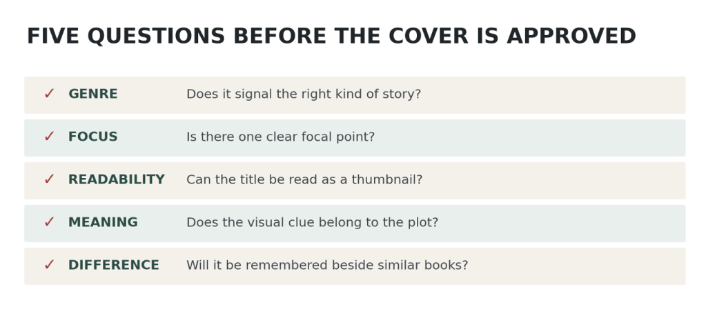
First, does the cover signal the correct kind of story? Genre should be recognizable through the combined effect of type, color, image, and mood. Second, is there one clear focal point? A reader should not have to decode five competing ideas. Third, does the title remain readable as a thumbnail? Online shopping has made small-scale clarity essential. Fourth, does the image contain a meaningful clue rather than a random symbol of danger? The best clue becomes more interesting after the book is read. Fifth, what makes this cover different from the books beside it?
These questions create a balance between marketing and storytelling. The cover must sell the book, but it should also respect the story. That requires collaboration among editors, marketers, authors, art directors, and designers. It also requires testing. A beautiful cover at full size may fail on a phone. A mysterious image may be too vague for the intended audience. A title that looks dramatic may become unreadable when reduced.
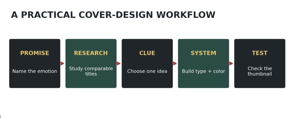
An effective workflow moves from broad to specific. It begins with the emotional promise of the story, studies comparable titles, selects one central visual idea, develops type and color around that idea, and tests the result in realistic settings. The final check is not simply whether the cover looks attractive. It is whether the right reader understands the promise.
This approach also protects originality. Instead of asking how to make a cover “look like a thriller,” the designer can ask what kind of tension belongs to this thriller. Confinement, deception, disappearance, surveillance, and domestic danger can all produce suspense, but they should not look identical. A formula is most useful when it acts as a structure, not a cage.
What Happens Before Page One
Return to the bookstore table. The reader still has not opened a book, but several decisions have already happened. One cover was recognized as a thriller. Another seemed too familiar. A third offered a clue that created a question. The reader picked it up.
That moment shows the real power of cover design. A thriller cover does not simply decorate a finished story. It begins the reader’s experience by setting an emotional temperature, creating expectations, and withholding just enough information. Typography can sound like a warning. Color can make a familiar room feel unsafe. A single image can suggest a conflict without revealing it.
The thriller cover formula works because it speaks a language readers already understand. Dark settings, bold titles, limited palettes, and incomplete scenes help the genre announce itself quickly. Yet recognition is only the beginning. The covers that remain memorable add one decision that belongs to the specific book. They use convention to reach the right audience and originality to make a promise worth following.
Before the first page is turned, the story has already started.
References
Bergström, B. (2008). Essentials of visual communication. Laurence King Publishing. [Course resource, Module 1]
Bridgeable. (n.d.). The top 5 behavioural economics principles for designers. https://www.bridgeable.com/ideas/the-top-5-behavioural-economics-principles-for-designers/ [Course resource, Module 4]
Busche, L. (n.d.). Simplicity, symmetry and more: Gestalt theory and the design principles it gave birth to. Canva. https://www.canva.com/learn/gestalt-theory/ [Course resource, Module 4]
D’Astous, A., Colbert, F., & Mbarek, I. (2006). Factors influencing readers’ interest in new book releases: An experimental study. Poetics, 34(2), 134–147. https://doi.org/10.1016/j.poetic.2005.12.001
Gitner, S. (2015). Multimedia storytelling for digital communicators in a multiplatform world. Routledge. [Course resource, Module 1]
Gudinavičius, A., & Šuminas, A. (2018). Choosing a book by its cover: Analysis of a reader’s choice. Journal of Documentation, 74(2), 430–446. https://doi.org/10.1108/JD-09-2016-0111
Haraguchi, D., Iwana, B. K., & Uchida, S. (2024). What text design characterizes book genres? In Document analysis systems: DAS 2024 (pp. 165–181). Springer. https://doi.org/10.1007/978-3-031-70442-0_10
Knowlton, S. A., & Hackert, L. N. (2015). Value added: Book covers provide additional impetus for academic library patrons to check out books. Library Resources & Technical Services, 59(3), 112–119. https://doi.org/10.5860/lrts.59n3.112
Lupton, E. (2017). Design is storytelling. Cooper Hewitt, Smithsonian Design Museum. [Course resource, Module 3]
McLeod, S. (2023). Visual perception theory. Simply Psychology. https://www.simplypsychology.org/perception-theories.html [Course resource, Module 4]
Monotype. (2023). 4 popular book cover design trends in 2023. https://www.monotype.com/resources/articles/4-popular-book-cover-design-trends-2023
Nakahata, S., Yoshikawa, T., Yamazaki, K., & Ueda, K. (2016). Effects of color of book cover and typeface of title and author name on gaze duration and choice behavior for books: Evidence from an eye-tracking experiment. Proceedings of the Association for Information Science and Technology, 53(1), 1–4. https://doi.org/10.1002/pra2.2016.14505301100
Norman, D. (2003). 3 ways good design makes you happy [Video]. TED Conferences. https://www.ted.com/talks/don_norman_3_ways_good_design_makes_you_happy [Course resource, Module 3]
Ramondo, A. (n.d.). The ins and outs of cover design. Penguin Random House. https://authornews.penguinrandomhouse.com/the-ins-and-outs-of-cover-design/
Reedsy. (n.d.). Thriller book covers: 40+ examples and design ideas. https://reedsy.com/design/book-covers/thriller
Wired. (2014). What makes for a brilliant book cover? A master explains. https://www.wired.com/2014/08/what-makes-for-a-brilliant-book-cover-a-master-explains/


Leave a Reply