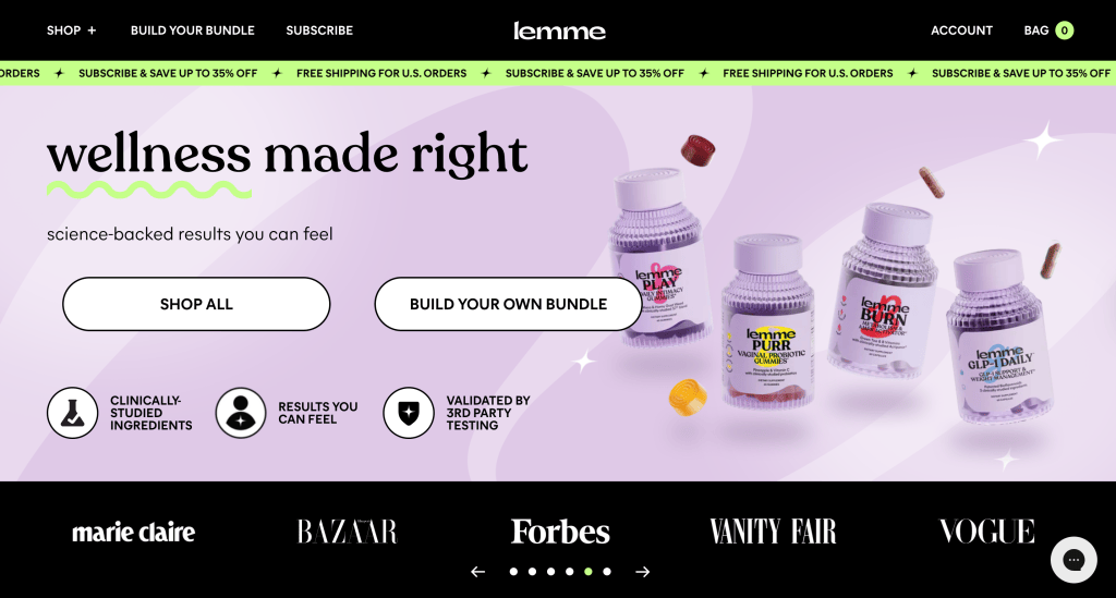
When people visit a website, they don’t read everything. They scan. Most users decide if they understand a page in just a few seconds. The Five Seconds Test is a UX method that measures that moment: what a user remembers after a quick first impression.
This method focuses on clarity, visual hierarchy, and whether the main message of a design is understood right away.
What is a Five-Second Test?
A Five-Second Test presents a design to participants for exactly five seconds. After the screen disappears, participants answer questions about what they remember.
The goal is not memorization, it’s understanding. If users cannot explain what the page was about after five seconds, the design probably isn’t communicating clearly.
This method is often used to test:
- landing pages
- app onboarding screens
- product pages
- advertisements
- homepage layouts

How the Five-Second Test Works
The process is simple but organized:
- Show a participant a screen for five seconds
- Hide the screen
- Ask recall questions
- Record answers
- Repeat this with multiple users
The main questions typically include:
- What was this page about?
- What stood out the most?
- What action were you supposed to take?
- What do you remember visually?
Patterns in responses show whether the design communicates its intent quickly.
Tools Used for a Five Seconds Test
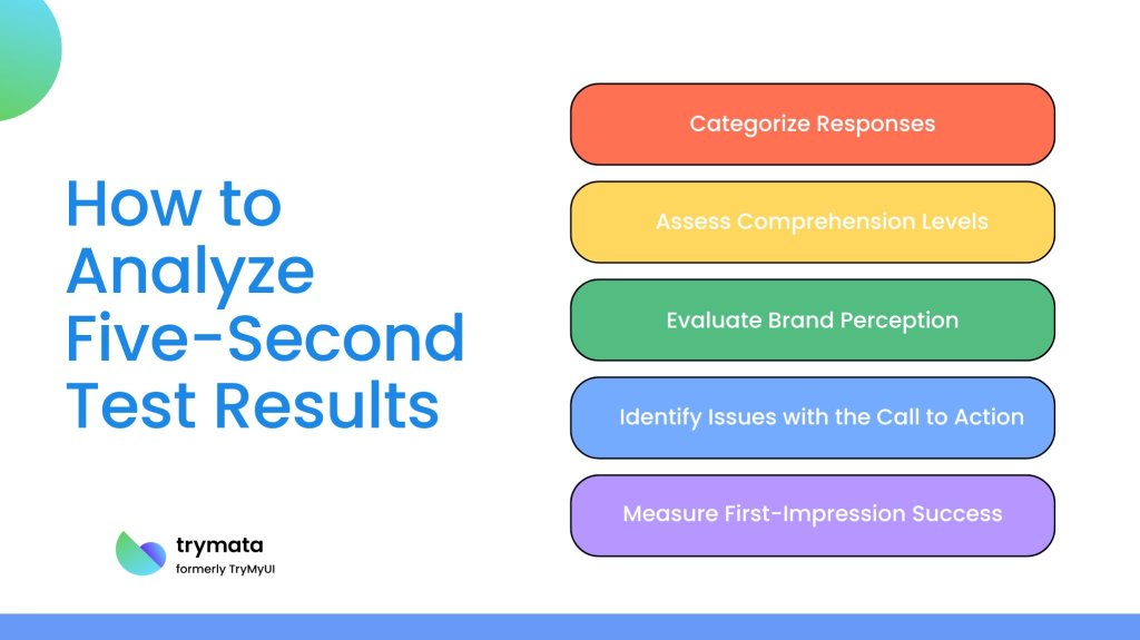
Test Several digital tools make this method easy to run:
- UsabilityHub is built specifically for quick perception tests.
- Maze, which supports remote UX testing.
- Lookback, which records user reactions.
- Google Forms plus screen share, a simple DIY option.
Research Examples Using the Five-Second Test
Study 1: Landing Page Clarity
A marketing research group tested different homepage layouts for an e-commerce brand. Participants remembered the hero image but often forgot the value proposition. The designers moved the headline above the image, resulting in an increase in conversions. The test showed that visual focus was more important than messaging placement.
https://www.smashingmagazine.com/2023/12/five-second-testing-case-study/
Study 2: App Onboarding Screens
A mobile app company tested onboarding screens with a Five Seconds Test. Users recalled the decorative illustrations but overlooked the instructions. The redesign simplified the visuals and improved the retention of key onboarding steps.
https://maze.co/collections/user-research/five-second-test/
Study 3: Nonprofit Website Messaging
A nonprofit organization conducted the test to see if visitors understood their mission. Most participants could describe the visuals but struggled to explain the organization’s purpose. After adjusting the typography and messaging hierarchy, comprehension improved significantly.
https://www.nngroup.com/videos/5-second-usability-test/
Why This Method Matters
The Five Seconds Test highlights a simple truth: users don’t study websites, they glance at them.
If a design fails to communicate instantly, it risks losing attention. This method forces designers to focus on clarity instead of decoration and makes sure that the most important information stands out.
It’s quick, cheap, and surprisingly revealing.
Final Thoughts
The Five Seconds Test is powerful because of its straightforward honesty. It eliminates guesswork and reveals whether a design actually works in practice. In a world where attention spans are short and competition is fierce, those first five seconds can decide if a user stays or goes.


Leave a Reply