
When we discuss usability testing in theory, it seems simple: observe users, find problem areas, and give suggestions. However, running the sessions showed me how much user behavior differs from what we, as designers and strategists, expect.
For this project, I tested the Rhode Skin website to see how well users can complete key e-commerce tasks. My complete usability report includes the method, script, tasks, timing data, and suggestions. In this post, I will focus on what the sessions revealed and why it is important.
The Goal of the Study
The goal of this usability test was to observe real users as they navigated Rhode’s website and identify areas that affect clarity, trust, purchase confidence, and efficiency.
Three participants completed five structured tasks while using a think-aloud method. Each session lasted about 25 to 35 minutes and took place remotely via Zoom.
Before starting, participants were reminded, “We are testing the website, not you.” This helped make them more comfortable and honest in their feedback.
The Tasks
Participants were asked to:
- Find and explore the Peptide Lip Treatment
- Compare two products for dry skin
- Add a product to the cart and begin checkout
- Locate the return policy
- Find information about Rhode’s philosophy and ingredients
On paper, these tasks seem simple. In practice, they revealed important insights about usability.
What Worked Well
Product Discovery Was Strong
All participants quickly found the Peptide Lip Treatment. The homepage visuals and simple navigation helped support intuitive product discovery. This showed that Rhode’s design fits well with user expectations for a modern skincare brand.
Checkout Flow Was Smooth
Participants could add products to the cart and proceed to checkout without confusion. The flow felt clear and direct. However, some small hesitations arose when shipping costs were not immediately visible. While this didn’t stop task completion, it did affect purchase confidence.
Where Friction Appeared
Product Comparison Was Difficult
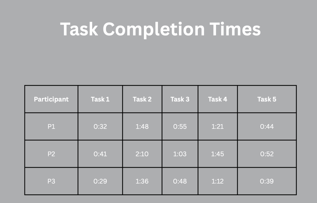
Task 2 took the longest on average. Participants had to switch between product pages to compare ingredients and benefits. One participant mentioned, “I wish I could see these next to each other.” This pointed out the lack of a comparison feature. While Rhode’s design is beautifully minimal, it forces users to mentally track differences rather than visually compare them.
The Return Policy Felt Hidden
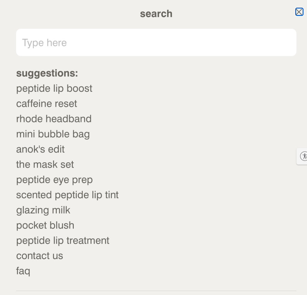
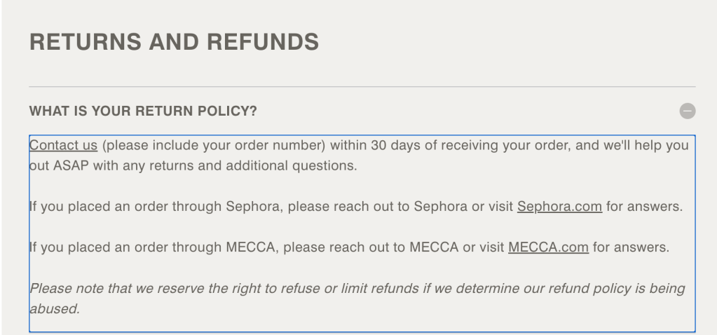
Two participants scrolled a lot before finding the return policy in the footer. One even used the browser search function. One participant stated, “I always check returns first. This feels hidden.” This was labeled a high-severity issue because clarity about returns directly affects trust and buying decisions.
Users Skim More Than They Read
One of my biggest takeaways from these sessions was how quickly users skim rather than read. Even in the brand philosophy and ingredient sections, participants scanned the text blocks rather than carefully reviewing them. Dense formatting slowed down comprehension. This reinforced what I’ve been noticing in digital behavior lately: clarity and structure are just as important as design.
Key Findings
From my analysis of the Rhode Skin Usability Test, the main usability issues were:
- No side-by-side product comparison tool
- Limited visibility of the return policy
- Delayed shipping cost transparency
- Text-heavy ingredient formatting
These aren’t major structural failures; they are small friction points. But these micro-friction points impact conversion psychology.
Embedded Session Excerpt
Below is a short excerpt from one of the usability sessions that shows the return policy search behavior and product comparison issues.
This clip illustrates how hesitation and scrolling behavior indicate uncertainty, even when users eventually succeed.
Visual Documentation
Here are screenshots from the testing process and the task timing table.
Final Reflection
Rhode Skin’s website shines in branding, visual design, and product discovery. However, this study highlighted that strong branding alone does not guarantee clarity. Minimal interfaces can unintentionally hide essential information.
Usability testing made one thing clear: Users do not navigate the way designers expect. They scan, hesitate, compare, and seek reassurance before committing.
Small improvements in visibility and comparison features could significantly boost user confidence and readiness to convert.
Conducting this study reminded me that usability testing is essential, not optional.


Leave a Reply