The Rhode Skin website serves as the brand’s primary digital platform for presenting skincare products and communicating its philosophy of simple, effective skincare routines. While the website reflects Rhode’s minimalist aesthetic and strong visual branding, user experience research reveals several opportunities to improve navigation, product discovery, and information clarity.
This semester-long usability project evaluated the Rhode website using multiple research methods to identify usability challenges and propose design improvements. The project demonstrates how UX research can be applied to analyze a real website, understand user behavior, and develop practical solutions that improve the overall digital experience.
The complete UX evaluation report can be viewed here:
Project Overview
The goal of this project was to evaluate how users interact with the Rhode Skin website and identify opportunities to improve usability while maintaining the brand’s clean and minimal visual identity.
The research focused on three key questions:
- How easily can users navigate the Rhode website?
- Can users quickly locate product information and ingredients?
- Does the website structure support efficient product discovery?
To answer these questions, several UX research methods were applied throughout the semester.
These methods included:
- Personas and scenarios
- User interviews
- Online surveys
- Card sorting studies
- Diary studies
- Heuristic evaluation
- Usability testing
Using multiple research methods allowed usability findings to be validated across several different perspectives and user behaviors.
Website Overview
The Rhode Skin website functions primarily as an e-commerce platform designed to promote and sell skincare products while communicating the brand’s philosophy of minimal skincare routines.
The website serves several important purposes:
- Present Rhode’s skincare product line
- Communicate brand identity and aesthetic
- Educate consumers about ingredients and product usage
- Facilitate online purchasing
The design emphasizes a clean interface, neutral color palette, and product-focused imagery that aligns with Rhode’s brand identity.
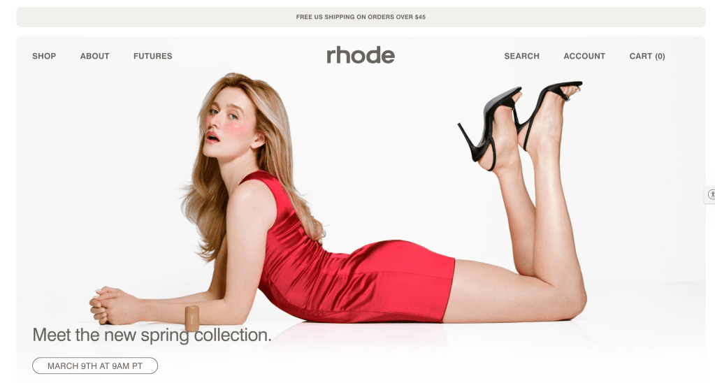
Research revealed that while the visual design is appealing, users sometimes experience difficulty locating product information quickly.
Target Audience
The Rhode website serves several different types of users with varying browsing behaviors and needs.
Social Media Influenced Consumers
Many users first discover Rhode products through platforms such as TikTok and Instagram. These users often rely on influencer recommendations and trend-driven skincare content when discovering new brands.
These users expect websites to provide clear product explanations and fast access to trending products.
Skincare Enthusiasts
Skincare enthusiasts tend to research ingredients and product effectiveness before making purchases. This group values transparency and detailed product information.
Websites that clearly explain ingredients, benefits, and routines tend to build higher trust among this audience.
Busy Professionals
Another important audience group includes busy consumers looking for efficient and straightforward skincare solutions.
These users prefer websites that allow quick browsing, easy navigation, and fast purchasing experiences.
Identified Website Issues
Initial evaluation of the Rhode website revealed several usability concerns.
Common challenges included:
- Limited navigation categories
- Minimal filtering options for products
- Unclear grouping of skincare products
- Additional scrolling required to locate product information
- Mobile navigation requiring extra steps
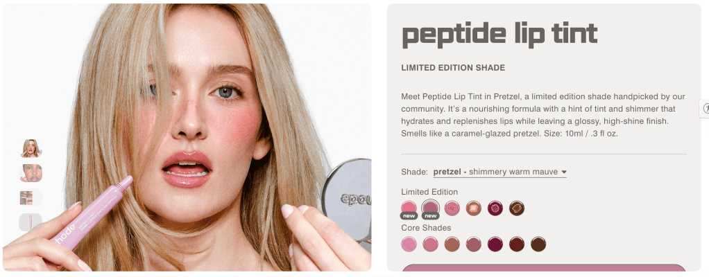
Although the website design is visually appealing, these issues can slow down the browsing experience and make it harder for users to quickly locate the information they need.
Competitor Analysis
To better understand how Rhode compares to other skincare brands, competitor websites were analyzed.
The competitors included:
- Glossier
- Summer Fridays
- Drunk Elephant
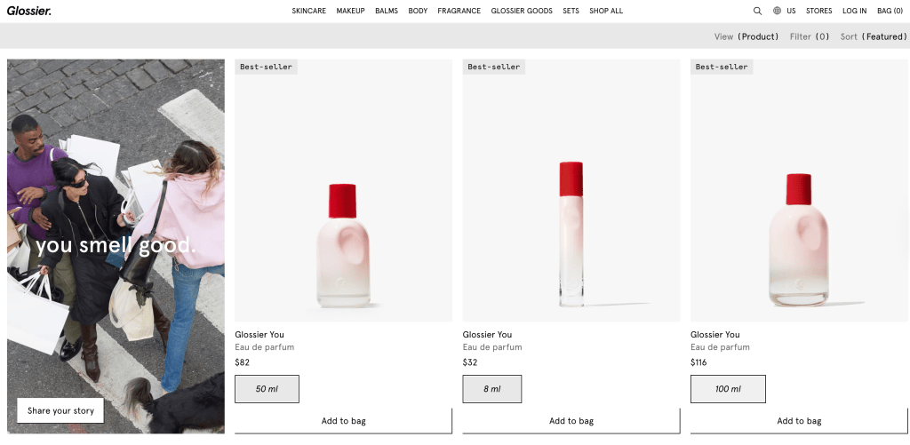
Glossier organizes its products by skincare routines and categories such as cleansers, moisturizers, and treatments. This structure helps users easily identify products that match their skincare needs.
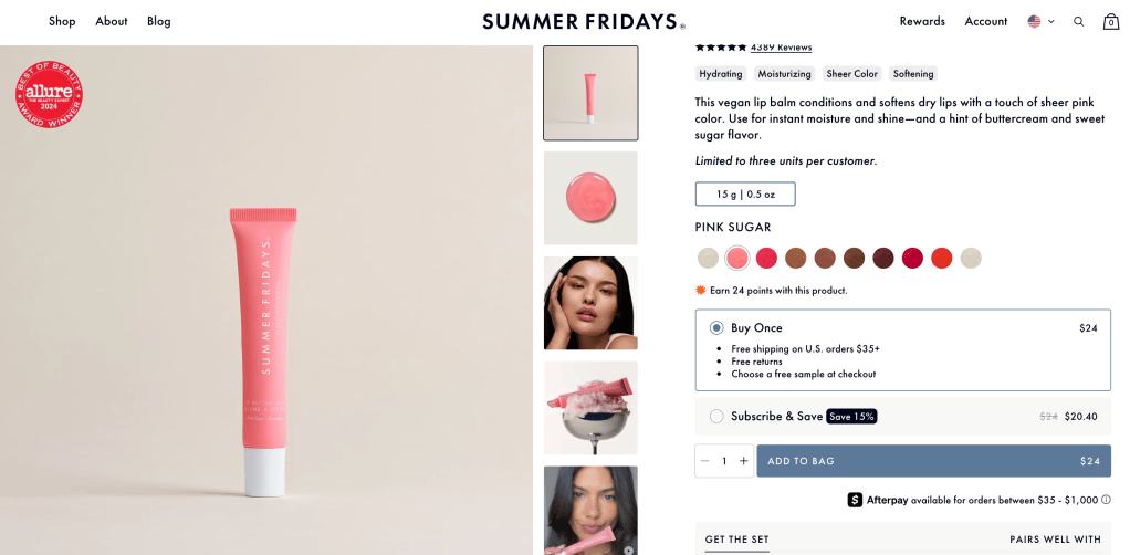
Summer Fridays focuses heavily on ingredient education, offering detailed descriptions that help consumers understand how products work.
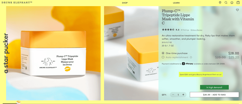
The competitor analysis revealed several design strategies that improve usability.
These strategies include:
- Routine-based navigation
- Product filtering options
- Clear ingredient explanations
- Structured product education
These insights helped guide the design recommendations for the Rhode website.
Personas and User Scenarios
Personas were created to represent key audience segments interacting with the Rhode website.
Three personas were developed:
- Olivia Martinez — College student influenced by social media skincare trends
- Emma Collins — Skincare enthusiast focused on ingredient transparency
- Lauren Thompson — Busy professional seeking efficient skincare solutions
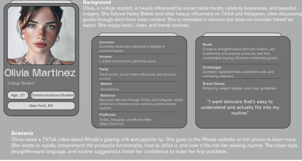
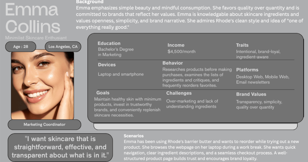
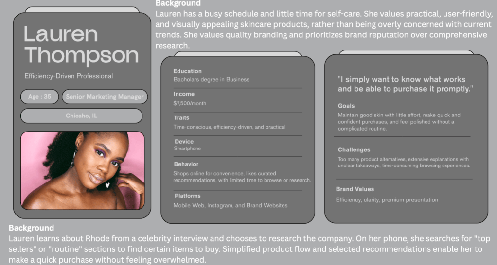
These personas illustrate different user motivations, browsing behaviors, and expectations when interacting with skincare websites.
Using personas helped ensure that the usability analysis reflected realistic user needs.
Interview Study
User interviews were conducted to understand how individuals discover skincare products and interact with skincare websites.
Participants were asked questions related to:
- Skincare habits
- Product research behavior
- Website navigation preferences
Interview findings revealed several consistent patterns:
- Social media plays a major role in product discovery
- Ingredient transparency increases user trust
- Users prefer simple skincare routines
These insights helped clarify how users approach skincare websites and what information they prioritize when browsing products.
Survey Study
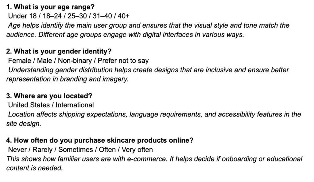
A survey containing 20 questions was distributed to collect broader feedback about skincare habits and website usability preferences.
The survey focused on three categories:
- Demographic information
- Skincare habits
- Website usability preferences
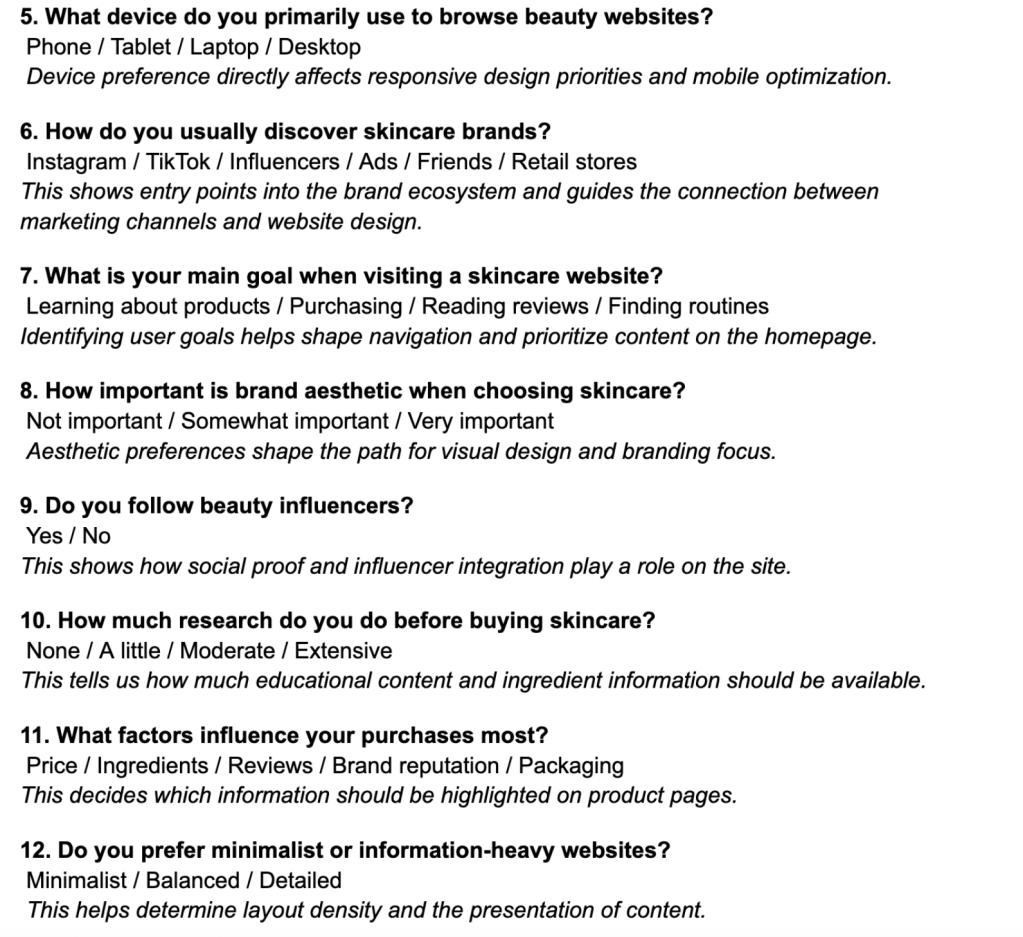
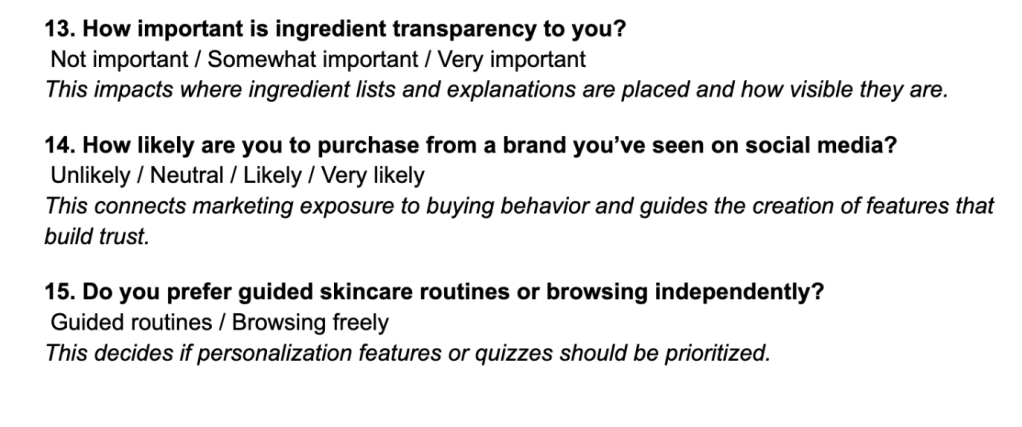
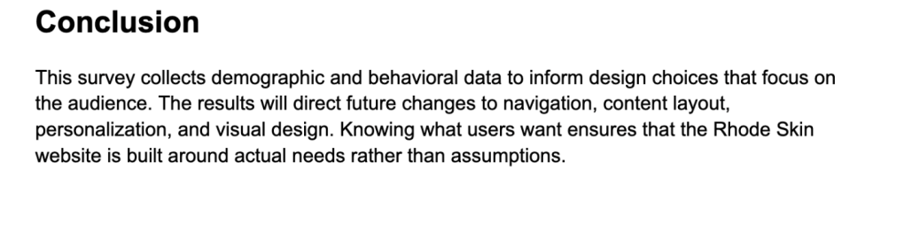
Survey results showed that:
- Most users browse skincare websites on mobile devices
- Simple navigation improves browsing efficiency
- Ingredient explanations increase purchasing confidence
These findings highlight the importance of clear navigation and accessible information in skincare e-commerce websites.
Card Sorting Study
A hybrid card sorting study was conducted to understand how users mentally organize skincare content.
Participants sorted 30–40 cards representing website content into categories that made sense to them.
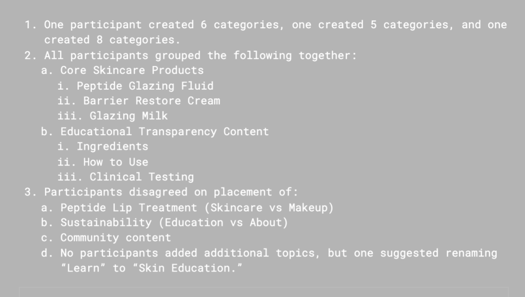
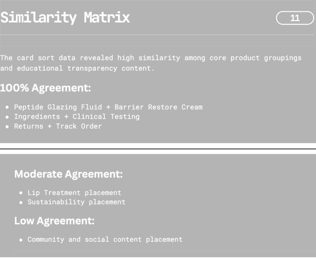
Participants commonly grouped products based on:
- Skincare routines
- Product types
- Skincare concerns
This suggests that Rhode’s navigation structure could be improved by aligning website categories with how users naturally organize skincare information.
Diary Study
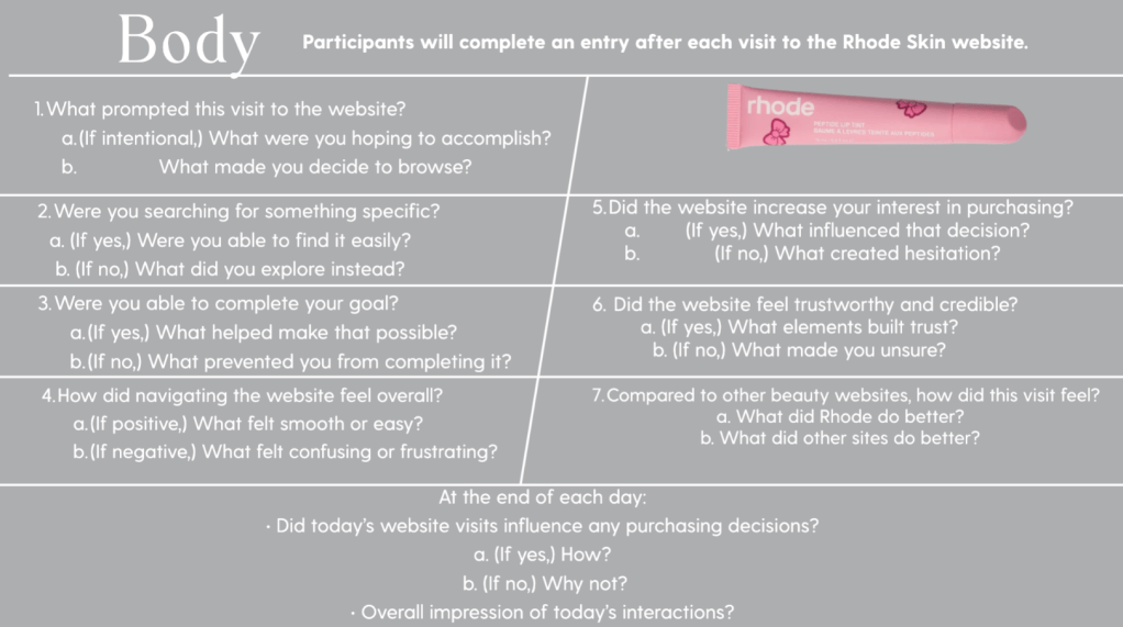
A diary study was used to observe how users interact with skincare websites over time.
Participants recorded their experiences researching skincare products and visiting brand websites.
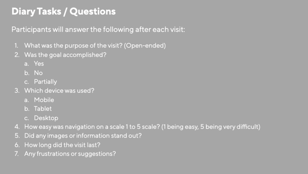
Diary entries revealed that many users first discover skincare products through social media before visiting brand websites to learn more about ingredients and product benefits.
This reinforces the importance of clear product education and accessible information on brand websites.
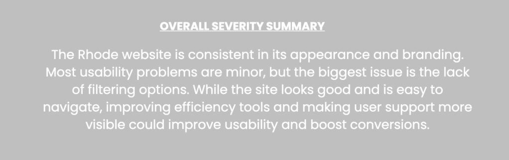
Heuristic Evaluation
A heuristic evaluation was conducted using Nielsen’s usability principles to identify usability issues within the Rhode website.
Usability Testing
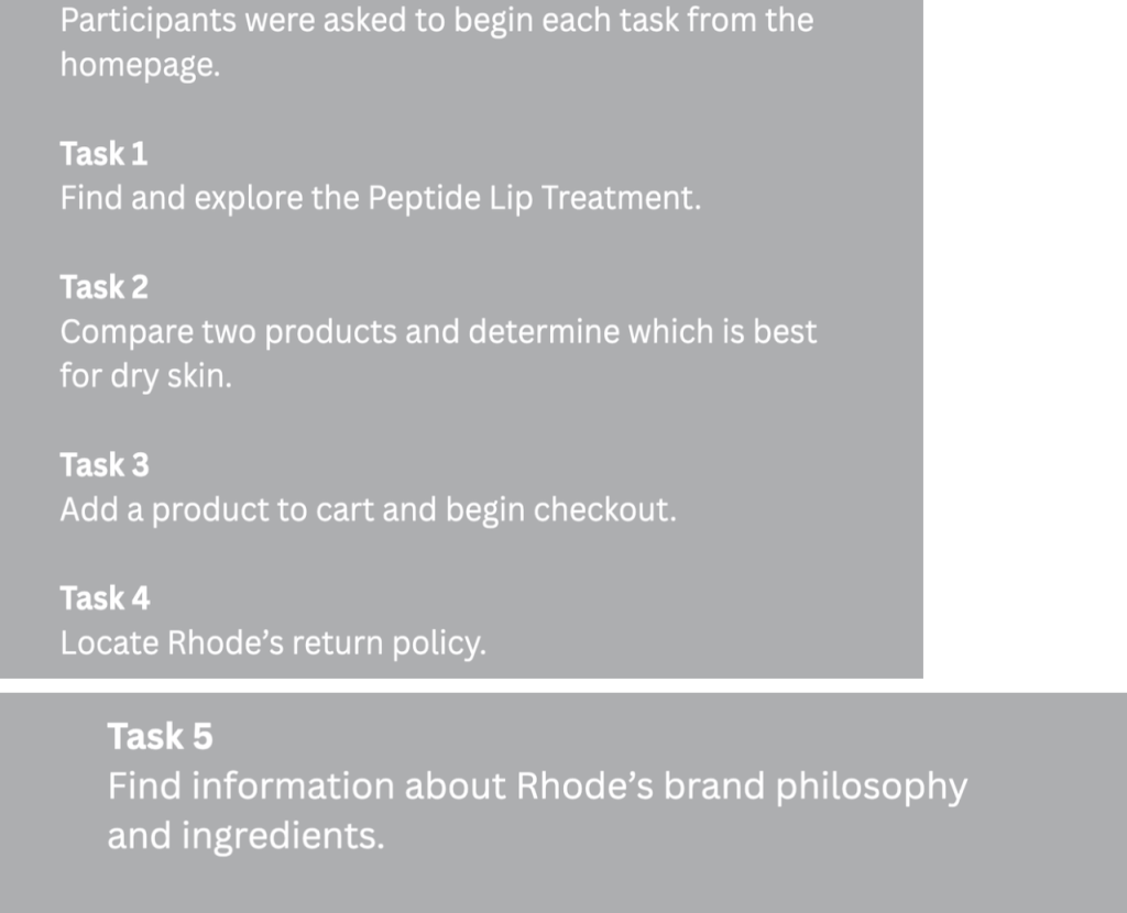
Usability testing was conducted with three participants who completed several tasks on the Rhode website.
Tasks included:
- Locating a product
- Identifying ingredient information
- Learning how to use a product
- Adding a product to the cart
- Reviewing checkout steps
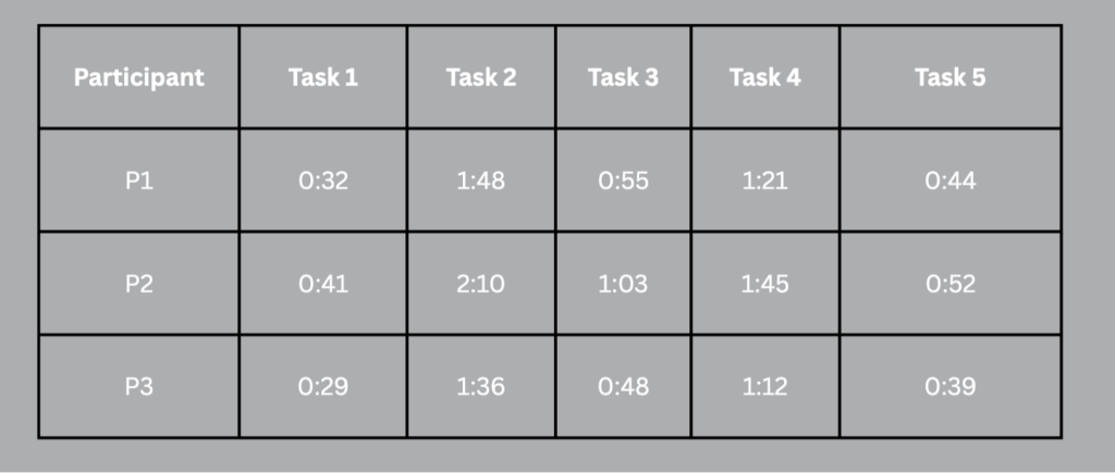
Most participants successfully completed the tasks, but some required additional navigation steps to locate product information.
This indicates that while the website is usable, improvements could streamline the browsing process.
Final Recommendations
Based on the research findings, several improvements are recommended to enhance the Rhode website’s usability.
Improve Navigation Structure
Navigation categories should be expanded and organized by skincare routines and product types to match user expectations.
Add Filtering Options
Filtering tools should allow users to quickly identify products based on skin concerns, ingredients, or product type.
Improve Product Education
Clear ingredient explanations and product usage guides should be incorporated to help users understand how products fit into their skincare routine.
Simplify Mobile Navigation
Since many users browse skincare websites on mobile devices, reducing scrolling and simplifying mobile navigation would improve usability.
Conclusion
This usability evaluation demonstrates how user experience research can uncover opportunities to improve digital product design.
The Rhode website successfully communicates the brand’s aesthetic and identity, but several usability improvements could enhance product discovery and navigation efficiency.
By implementing improved navigation structures, filtering tools, and product education features, the Rhode website could create a more intuitive and efficient browsing experience while maintaining its minimalist design.


Leave a Reply