The Dark Edit

Stories, culture, design, and life online through my lens.

  • How visual clues reveal the stories hidden inside an image

    Dark visual storytelling collage featuring four women from film, fashion, and music.

    The Story Starts Before We Know It

    We often understand the feeling of an image before we even realize how many details we have noticed. A facial expression, a reflection, the color of a dress, or something placed in the background can make us wonder who a person is and what brought them to that moment. The most interesting images do not reveal the entire story. Instead, they provide just enough visual clues for us to imagine what may have happened before the picture was taken and what could happen afterward.

    The seven images in this collection come from film, fashion, music, and popular culture. Although they come from different sources, they are connected by the way small details reveal something deeper about each woman’s story. Mirrors can represent divided identities, clothing can communicate feelings without words, and settings can show the difference between someone’s polished public image and what they may be experiencing privately. By looking more closely at composition, color, lighting, body language, symbolism, and point of view, we can see how even the smallest detail can help an image tell a much larger story.

    The Reflection Before the Transformation

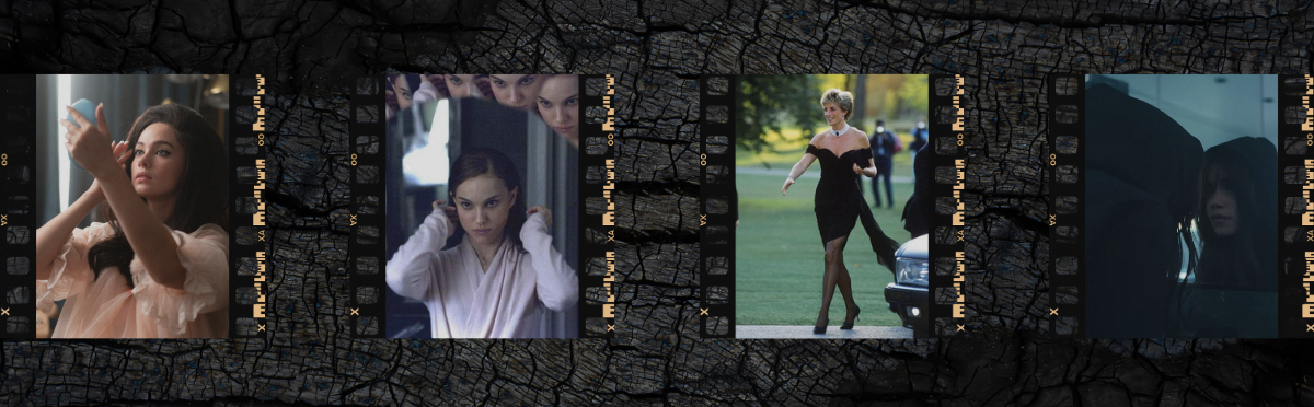
    Priscilla holds a blue hand mirror while studying her makeup in a pink nightgown.
    Cailee Spaeny as Priscilla Presley in Priscilla (2023). Image courtesy of A24, via Refinery29.

    In this still from Priscilla, a normal beauty routine becomes a quiet moment of change. The blue hand mirror creates a visual hierarchy that draws our attention to Priscilla’s focused expression before we notice the carefully applied eyeliner, styled hair, and pale-pink nightgown. These details make her appear young and soft, but her serious expression shows that getting ready does not feel playful or effortless. The bright light beside her face contrasts with the darker background, separating the polished appearance she is creating from everything happening outside the frame. Her hands also partly block the mirror, preventing us from seeing her complete reflection. This suggests that Priscilla is still caught between two versions of herself: the young girl she was before Elvis and the public figure she is expected to become. Although the finished look may appear effortless to everyone else, this private moment reveals the time, concentration, and pressure involved in creating it.

    When One Reflection Becomes Many

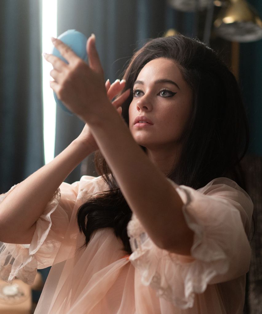
    Nina adjusts her hair while multiple mirror panels fragment and repeat her reflection.
    Natalie Portman as Nina in Black Swan (2010). Image courtesy of Searchlight Pictures, via Vogue.

    While Priscilla looks into one controlled reflection, Nina is surrounded by more versions of herself than she can handle. The mirrors divide and repeat her face across the frame, making the simple act of fixing her hair feel unsettling. This repetition creates visual rhythm, but it also makes it difficult to separate the real Nina from all the reflections around her. Her pale-pink clothing suggests softness and innocence, while the cool lighting, dark shadows, and serious expression create a feeling of psychological tension. The tight framing leaves almost no empty space, making it seem as if the reflections are closing in on her. Before this moment, Nina has already been pressured to perform two completely different roles in Swan Lake. The composition shows that this pressure is beginning to affect how she sees herself. Her transformation may look beautiful from the outside, but the mirrors suggest that her need to be perfect is slowly becoming destructive.

    When Femininity Becomes a Performance

    Elaine sits in a pink tearoom wearing a flowered hat, lace clothing, blue eyeshadow, and red nails.
    Samantha Robinson as Elaine in The Love Witch (2016), written and directed by Anna Biller. Image via Topanga New Times.

    The mirrors surrounding Nina show her struggling with her identity, while Elaine in The Love Witch uses her appearance as a type of performance. Elaine looks calm and perfectly put together, but every detail in the composition feels carefully planned. Her oversized pink hat creates a visual hierarchy by making her the main focal point, while her blue eyeshadow, red nails, lace outfit, jewelry, and floral tea set add to the exaggerated version of femininity she has created. Pink normally symbolizes romance and softness, but the intense use of color makes the setting feel almost too perfect to be real. Her straight posture and upward gaze also act as visual clues. Even though she is in a crowded tearoom, her body language separates her from the blurry people in the background. Before this moment, Elaine has created a version of herself that she believes men will want. She later uses that polished appearance to attract and influence them. Through color, costume, setting, and symbolism, the image shows how femininity can become both a fantasy and a source of power.

    The Dress That Spoke for Her

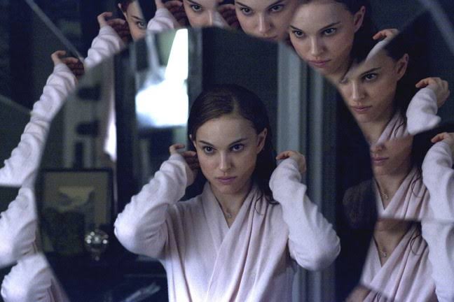
    Princess Diana walks confidently in a fitted black off-the-shoulder dress after stepping away from a car.
    Princess Diana arriving at London’s Serpentine Gallery in 1994. Photograph by Jayne Fincher/Getty Images, via British Vogue.

    Elaine uses clothing to create a fantasy, while Princess Diana’s black dress communicates something more personal and public. The photograph captures Diana smiling and moving forward, while the fabric trailing behind her creates a sense of movement within the still image. Her fitted, off-the-shoulder dress also goes against the more conservative clothing normally expected of a royal woman. The black dress contrasts with the bright green background, making Diana the clear focal point, while her sapphire-and-pearl necklace helps direct attention toward her face. This visual hierarchy is important because it was not an ordinary public appearance. Diana arrived at the Serpentine Gallery on the same night Prince Charles publicly discussed his infidelity. The waiting car and people in the background provide context and show that she knows she is entering a space where she will be photographed. Knowing what happened before this moment changes how we see the dress. Instead of being just a fashion choice, it becomes a deliberate form of self-expression. Through contrast, movement, clothing, and context, the photograph turns her arrival into a powerful statement about confidence and taking back control.

    Freedom as a Carefully Created Image

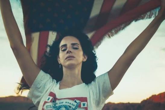
    Lana Del Rey stands beneath an American flag with her arms raised and eyes closed against a desert landscape.
    Lana Del Rey in “Ride” (2012), directed by Anthony Mandler. Still from the official music video.

    Princess Diana uses fashion to take back control during a real public moment, while Lana Del Rey creates a fictional world where freedom becomes part of her identity. In this frame from “Ride,” the American flag stretches above Lana, making it look like both a form of protection and a stage. Her raised arms and closed eyes suggest freedom, surrender, or relief, while the low camera angle makes her appear more powerful. The open desert and warm lighting contrast with the enclosed settings shown earlier in the collection, making the space around her feel almost limitless. The flag also acts as a symbol of American independence and rebellion. Before this moment, the video presents Lana’s character as someone searching for freedom and a place where she belongs. Afterward, she continues traveling through a world of motorcycles, motels, and temporary relationships. Through its camera angle, lighting, setting, body language, and symbolism, the image does more than show freedom, it creates a romanticized version of what freedom is supposed to look and feel like.

    A Love Story Embroidered in Lace

    Kourtney Kardashian stands at her wedding altar wearing a cathedral-length veil embroidered with the Virgin Mary.
    Kourtney Kardashian and Travis Barker’s wedding in Portofino, Italy, 2022. Kardashian’s Dolce & Gabbana veil incorporates imagery inspired by Barker’s tattoo. Image via Page Six.

    Lana Del Rey’s image uses the American flag as a familiar symbol, while Kourtney Kardashian’s wedding veil turns a public ceremony into a more personal visual story. The couple’s faces are not the main focal point. Instead, the cathedral-length veil creates a visual path that leads our attention through the composition and toward the altar. The Virgin Mary embroidered into the veil reflects the religious image tattooed on Travis Barker’s head, turning the garment into a meaningful tribute to their relationship. The red roses, candles, gold decorations, and statue add to the dramatic Italian-Catholic setting. At the same time, the white veil contrasts with Travis’s black suit, helping Kourtney stand out within the detailed scene. The symmetry of the composition creates a sense of tradition and importance, while the personalized embroidery makes the wedding feel unique to the couple. Before the ceremony, Kourtney worked with Dolce & Gabbana to include these personal references in her outfit. Afterward, the veil becomes a lasting reminder of how they wanted their relationship and wedding to be remembered. Instead of relying on facial expressions, this image tells its story through symbolism, contrast, composition, and objects filled with personal meaning.

    What the Mirror Does Not Reveal

    Nessa Barrett faces a bathroom mirror wearing a black hood while cold blue light fills the room.
    Nessa Barrett in “dying on the inside” (2022), directed by JakeTheShooter and Hunter Moreno. Still from the official music video.

    The final image returns to the use of a mirror, but it shows something very different from Priscilla’s controlled beauty routine at the beginning of the collection. Nessa Barrett faces her bathroom reflection in an oversized black hood, while her hair covers most of her eyes. Instead of helping her create a perfect appearance, the mirror makes it difficult for viewers to see her clearly. The camera angle shows both her back and her reflection, creating two versions of Nessa within the same composition. The cold blue lighting also takes away the warmth we might normally connect with a private bathroom setting. Her dark clothing and lowered body language contrast with the bright window behind her, making the outside world feel distant. The song focuses on the pressure to look fine while privately struggling, and the visual composition communicates that difference without needing a dramatic action. Before this moment, Nessa has entered the bathroom alone, and afterward, she may leave looking completely put together. Through lighting, contrast, body language, framing, and point of view, the image reveals the private part of her story that other people may never see.

    The Story Continues Beyond the Frame

    Although these seven women are shown in very different situations, each image depends on small details that could easily be missed. A mirror can represent transformation or a divided identity. A dress can communicate confidence and rebellion, while a veil can preserve a personal connection. Color, lighting, body language, framing, and symbolic objects all act as visual clues. They guide viewers toward the story without revealing every answer.

    This way of looking closely connects to Seth Gitner’s discussion of how visual storytelling appears in everyday life and Bo Bergström’s explanation of storytelling as an important part of visual communication. It also relates to the “Jury Room Analysis” video, where objects, facial expressions, and the placement of people become evidence that viewers use to understand a larger event. The strongest images do not need to explain everything. Instead, they provide enough details for viewers to use context and imagination to take part in the story. Looking closer does not only reveal what is inside the frame. It also helps us imagine the larger story continuing beyond it.

    Sources and References

    Image Sources

    Module References

  • May 2, 2026

    When I started this project, I didn’t just want to redesign a brand; I wanted to rethink how trust is communicated visually. For my final project, I focused on Rinaldi Electric, a local, family-owned electrical company with a strong reputation built on reliability and relationships. The challenge wasn’t to fix something broken, but to elevate something that already works.

    This project pushed me to think like both a designer and a strategist. Instead of jumping straight into visuals, I started by asking: What does this brand need to say before it even speaks?

    Understanding the Brand First

    Rinaldi Electric is built on trust, responsiveness, and long-term customer relationships. That became the foundation of every design decision I made. The goal of this redesign was to create a brand that:

    • Feels more modern and professional
    • Builds trust instantly with homeowners
    • Works consistently across web, print, and service materials

    As shown in my deck, this wasn’t about changing the identity completely; it was about strengthening how that trust is visually communicated.

    Research That Shaped My Direction

    One of the most important parts of this project was analyzing competitors. When I looked at companies like Keating Electric, Consolidated Hudson Electric, and Norco Electric, I noticed something interesting: they all focused heavily on function, but very little on brand identity.

    This created a huge opportunity.

    Most competitor websites were clean and informative, but visually generic. That insight directly influenced my approach. I wanted Rinaldi Electric to feel more refined and memorable without losing its professionalism.

    I also researched typography trends in the industry and found that clean sans-serif fonts dominate. Instead of blindly following that, I intentionally paired Montserrat and Open Sans to balance strong headlines with readability.

    Building a Cohesive Visual System

    From there, everything became about consistency.

    I developed a full visual system including:

    • A structured type hierarchy
    • A cohesive color palette (navy, white, electric blue, and safety accents)
    • Real, professional photography to build credibility
    • A refined logo approach that keeps brand recognition while improving presentation

    The color palette was especially important to me. Navy communicates trust and professionalism, while accent colors like electric blue and safety yellow create subtle moments of emphasis without overwhelming the design.

    Applying the Brand in Real Life

    What really brought this project together was applying the brand across real materials. Instead of just designing a logo, I created a full identity system including:

    • Business cards and vehicle decals
    • Website mockups with clear calls to action
    • An event poster focused on readability and hierarchy
    • A brochure with a structured, easy-to-follow layout
    • A newsletter to reinforce long-term brand consistency

    Each piece was designed with the same goal: to make information easy to understand while reinforcing trust at every touchpoint.

    What I Took Away From This Project

    This project changed how I think about design.

    Before this, I saw branding as mostly visual. Now, I see it as a system, one that combines strategy, psychology, and design to create a clear experience. Every choice I made had to answer a bigger question: Does this make the brand feel more trustworthy?

    In the end, this redesign isn’t just about looking better. It’s about feeling more credible, more modern, and more consistent across every interaction.

    Final Deck

  • April 26, 2026

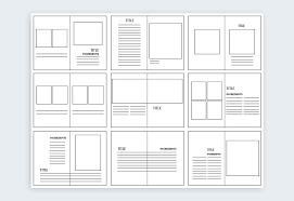
    Before this module, I honestly thought good design just meant making something “look nice.” If it felt balanced and aesthetically pleasing, I assumed I was doing it right. But after diving into grids, wireframes, and mockups, I realized something important: the best designs aren’t just pretty, they’re intentional.

    This week completely shifted how I approach visual design. Instead of starting with colors or fonts, I now start with structure.

    The Moment It Clicked for Me

    When I started working on my Rinaldi Electric website and newsletter, I initially jumped straight into designing the final version. I wanted it to look clean, modern, and professional. But I kept running into the same problem, that something always felt slightly “off,” even if I couldn’t explain why.

    Once I stepped back and created wireframes first, everything changed.

    Using a grid forced me to think more logically:

    • Where does the user’s eye go first?
    • What information matters most?
    • How do I guide someone through the page without overwhelming them?

    It made me realize that design isn’t just about visuals, but it’s about communication.

    Why Grids Actually Matter

    Grids are one of those things that feel invisible when they’re done well, but obvious when they’re not.

    After researching different layouts and real-world examples, I noticed that almost every professional website or newsletter uses some form of grid system. It’s what keeps everything aligned, consistent, and easy to follow.

    For my projects, I kept things simple:

    • A strong hero section at the top
    • Clean, stacked sections underneath
    • A clear call-to-action at the bottom

    This structure helped me create designs that feel organized without looking boring.

    From Wireframes to Final Design

    One of the biggest takeaways for me was understanding the difference between wireframes and comps.

    At first, wireframes felt unnecessary. They’re not visually exciting, and honestly, they’re just boxes and placeholders. But now I see them as the most important step in the process.

    Wireframes allowed me to:

    • Focus on layout without distractions
    • Experiment quickly with different structures
    • Fix problems before committing to design

    By the time I moved into my final comps, everything felt easier. I wasn’t guessing anymore; instead, I was building on a solid foundation.

    Designing With the User in Mind

    Something I kept thinking about throughout this process is how real people interact with design.

    For example, if someone is looking for an electrician, they don’t want to search around a complicated website. They want:

    • Clear services
    • Easy contact information
    • A sense of trust

    That’s why I focused on making my layouts simple and direct. Every section had a purpose, and every element supported that purpose.

    This is something I want to carry into my future work, especially as I continue pursuing social media and digital marketing. Design isn’t just about creativity; it’s about creating experiences that make sense.

    Final Thoughts

    This module helped me move from designing based on instinct to designing with intention. For my website, it was tricky navigating at first, but once I started the newsletter, the grids truly helped.

    Grids, wireframes, and mockups might seem like technical steps, but they completely change the outcome of a project. They make designs stronger, clearer, and more effective.

    Going forward, I know I won’t skip these steps again. If anything, they make the creative process feel more controlled and, honestly, more enjoyable.

    Because once the structure is there, everything else just falls into place.

  • April 19, 2026

    When most people think about design, they usually notice the colors, fonts, or images first. While those details are important, one of the most powerful design tools is hierarchy. Hierarchy in layout is what helps guide the viewer’s eye and makes information easier to understand. Without it, even a visually appealing design can feel cluttered and confusing.

    Hierarchy is the arrangement of elements according to their importance. Designers use size, spacing, contrast, alignment, and typography to show viewers what to look at first, second, and third. It creates order and makes content feel intentional instead of random.

    What Hierarchy Looks Like in Everyday Life

    We interact with hierarchy constantly, even if we do not realize it. When we open an app, visit a website, or look at a social media post, hierarchy is already directing our attention. Headlines are larger than body text. Buttons use bright colors. Important information is placed near the top.

    These choices are strategic. They help users move through information quickly and naturally.

    Why It Matters in Posters and Advertising

    Hierarchy becomes especially important in posters and promotional design. A viewer should immediately understand what they are looking at within seconds. The most important information needs to stand out first.

    For example, in a movie poster, the title is often the largest element because it needs instant attention. Supporting details such as actor names, taglines, and release dates are smaller because they are secondary.

    This week’s project helped me understand how hierarchy can create mood while still organizing information. The title grabs attention first, then the eye moves to the photos, and then to the smaller details at the bottom.

    Applying Hierarchy to Brand Design

    I also saw hierarchy while creating event posters for Rinaldi Electric. In that design, viewers need to know three things right away: what the event is, when it is happening, and how to respond. That means the event title should be the strongest, followed by the date and time, then the phone number or call to action.

    If everything is the same size or weight, nothing feels important. A good hierarchy solves that problem by creating a clear visual path.

    My Biggest Takeaway

    The biggest lesson I learned this week is that design is not just decoration. It is communication. Every size choice, spacing adjustment, and placement decision sends a message to the audience.

    Strong hierarchy can make a brand feel polished, trustworthy, modern, or exciting. Weak hierarchy can make a design feel overwhelming or forgettable.

    As someone interested in communication and branding, this topic is valuable because great ideas only work when people can understand them quickly.

    Final Thoughts

    The next time I see a strong ad, website, or poster, I know I will notice something different. I will pay attention to what caught my eye first, and how the designer made that happen.

  • April 5, 2026

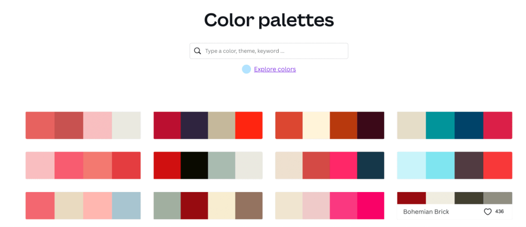
    Color is something we see every day, but most of the time we don’t actually think about how much it influences us. Before this module, I honestly saw color as more of an aesthetic choice. Like something that just makes a design look “good.” But after going through the readings and applying it to my own work, I’ve started to realize that color is actually one of the most powerful tools in design.

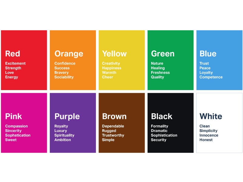
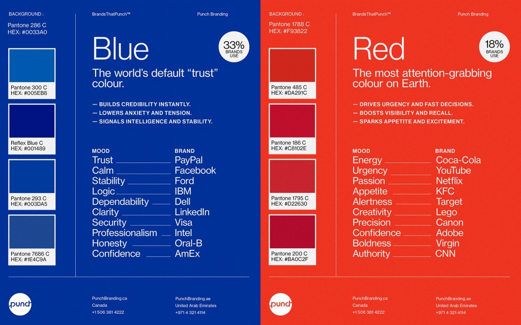
    Color psychology is the idea that colors can influence how people feel, think, and even behave. What stood out to me the most is that these reactions often happen without us even realizing it. For example, certain colors like red and orange are often associated with energy, urgency, or excitement, while colors like blue and green tend to feel more calming and stable. This made me think about how often brands and designers use color intentionally to shape how we experience something.

    In my own project this week, I experimented with different color schemes while keeping the design exactly the same. What surprised me the most was how much the mood changed just by switching the colors. A more neutral or monochromatic palette felt clean and minimal, while a high-contrast complementary palette felt bold and attention-grabbing. Even though the layout didn’t change, the design’s feel completely shifted. That really helped me understand that color is not just decoration, it’s communication.

    One idea from the readings that I found really interesting is how color can influence perception in ways that aren’t obvious. For example, color can impact how we judge things like quality, trust, or even taste. This is especially important in marketing and branding, where the goal is to create a specific emotional response. It also made me realize why consistency in color is so important, which connects to systems like Pantone that are used to standardize color across different platforms and materials.

    Another thing that stood out to me is that color meaning isn’t always universal. While there are general associations, color perception can change depending on culture, age, and context. This made me think more critically about designing for different audiences and not assuming that everyone will interpret color the same way. It adds another layer of responsibility when making design decisions.

    Overall, this module completely changed the way I think about color. I now see it as something that can guide attention, create emotion, and influence how a message is received. As someone interested in social media, branding, and content creation, this is especially important because color plays a huge role in how people engage with visual content. Moving forward, I want to be more intentional with my color choices, thinking beyond what looks good and focusing on what communicates the right feeling.

  • March 23, 2026

    When people think about branding, they usually think about logos, colors, and aesthetics. Before this module, I did too. But after diving deeper into brand identity and brand strategy, I realized that strong branding is not just about how something looks; it’s about how it works, how it communicates, and how it builds trust.

    This week completely shifted how I think about design, especially as someone interested in social media, marketing, and content creation.

    Brand Strategy Comes First

    One of the most important takeaways for me is that brand strategy always comes before brand identity.

    Brand strategy is the foundation. It answers questions like:

    • Who is this brand for?
    • What does the audience care about?
    • What makes this brand different?
    • How should people feel when they interact with it?

    Without answering these questions first, design decisions become random. A logo might look good, but it won’t mean anything.

    When I was working on my Rinaldi Electric brand proposal, this became very clear. I couldn’t just jump into designing a logo. I had to first understand:

    • The audience (homeowners, business owners, EV customers)
    • What they value (trust, safety, professionalism)
    • How they choose an electrician

    This made every design decision feel intentional instead of aesthetic.

    Brand Identity is How Strategy Shows Up Visually

    Once the strategy is clear, brand identity becomes the visual expression of it.

    This includes:

    • Logo
    • Color palette
    • Typography
    • Photography
    • Tone of voice

    What I found really interesting is how small visual choices can communicate big ideas.

    For example:

    • Navy blue can signal trust and reliability
    • Yellow accents can represent safety and energy
    • Clean typography can make a brand feel more professional

    These aren’t random choices; they are directly connected to how a brand wants to be perceived.

    In my project, I focused on creating a visual identity that felt:

    • Clean
    • Modern
    • Trustworthy
    • Professional

    Because that’s exactly what customers are looking for when hiring an electrician.

    Trust is the Most Important Factor in Service Brands

    Another idea that stood out to me is how much trust influences design, especially for service-based businesses.

    Hiring an electrician isn’t a casual decision. People are letting someone into their home or business, which makes branding even more important. If a website looks outdated or unprofessional, it can immediately create doubt.

    From my research and informal interviews, one thing kept coming up:

    People trust brands that look polished and organized.

    This made me realize that design is not just about creativity, it’s about reducing uncertainty.

    Good branding answers unspoken questions like:

    • “Can I trust this company?”
    • “Do they know what they’re doing?”
    • “Will they do a good job?”

    What This Means for Me as a Future Marketer

    This module helped me see myself not just as someone who creates content, but as someone who builds brand experiences.

    Going forward, I want to:

    • Be more intentional with design choices
    • Think about audience perception before aesthetics
    • Connect visuals back to strategy
    • Create content that builds trust, not just engagement

    Whether I’m working on social media, a campaign, or a full brand, I now understand that everything should connect back to a bigger strategy.

    Final Thought

    Brand identity is what people see.
    Brand strategy is what makes them believe.

    The strongest brands don’t just look good, they feel consistent, intentional, and trustworthy. And that starts long before the logo is ever designed.

  • March 8, 2026

    How TikTok Collects and Uses User Data

    TikTok has become one of the most powerful social media platforms for both content discovery and advertising. With millions of users scrolling through the app daily, the platform collects large amounts of user data to personalize content and improve ad targeting. While this data-driven system helps brands reach the right audiences, it also raises important questions about privacy and ethics in digital marketing.

    According to TikTok’s privacy policy, the platform collects several types of information. This includes basic account details such as usernames, email addresses, and phone numbers. TikTok also gathers behavioral data, including the videos users watch, how long they watch them, what they like or share, and the searches they make. In addition, the platform collects device-related information such as IP addresses, device type, and approximate location data. This information helps TikTok personalize the “For You” page and allows advertisers to target audiences based on interests and behavior (TikTok Privacy Policy).

    Privacy Concerns and Controversies

    Although TikTok’s personalized content and advertising model has helped the platform grow quickly, it has also raised privacy concerns. In 2019, the U.S. Federal Trade Commission fined TikTok $5.7 million for illegally collecting personal data from children under the age of 13 without parental consent. This case highlighted the risks of collecting data from younger users on social media platforms (FTC).

    More recently, TikTok has faced scrutiny from governments around the world regarding how user data is stored and accessed. Because TikTok is owned by the Chinese company ByteDance, some policymakers have expressed concerns about whether user data could potentially be accessed by foreign governments. Although TikTok states that it protects user data and has introduced new security measures, these concerns continue to spark debate about data privacy and platform accountability.

    Transparency and Consumer Protections

    Privacy laws such as the General Data Protection Regulation (GDPR) in Europe and the California Consumer Privacy Act (CCPA) in the United States aim to give users more control over how their personal data is used online. These regulations require companies to be transparent about their data collection practices and allow useers to request access to or deletion of their personal information.

    TikTok states that users can download their data, control ad personalization settings, and adjust privacy options in their account settings. However, many privacy experts argue that these tools can still be difficult for average users to navigate.

    This connects to ideas discussed in Faris Yakob’s Paid Attention, which explains that the platform itself shapes how advertising messages are delivered and perceived. Because platforms control the data used to target ads, they also hold significant responsibility for ensuring those practices remain ethical and transparent. In addition, Sharon Lee Thony’s The Marketing Campaign Playbook emphasizes that brands must adapt to evolving regulations and consumer expectations when using digital data for marketing.

    How TikTok Could Improve Privcacy Practices

    While TikTok has made efforts to address privacy concerns, there are several ways the platform could improve transparency and ethical advertising practices. One improvement would be simplifying privacy settings so users can more easily understand how their data is collected and used. Clearer explanations of how the advertising algorithm works could also increase transparency for users and advertisers.

    Another improvement would be publishing more detailed transparency reports that explain how data is stored and protected. Independent audits could further strengthen user trust. As social media continues to play a major role in marketing, platfomrs like TikTok must balance the benefits of personalized advertising with stronger privacy protections.

    Overall, TikTok demonstrates both the opportunities and challenges of data-driven marketing. Personalized content and advertising can create more relevant experiences for users, but maintaining trust requires ongoing improvements in transparency, privacy protections, and ethical data use.

    Sources

    TikTok Privacy Policy https://www.tiktok.com/legal/privacy-policy

    Federal Trade Commission (2019). TikTok fined $5.7 million for children’s privacy violations.
    https://www.ftc.gov/news-events/news/press-releases/2019/02/video-social-networking-app-musically-agrees-settle-ftc-allegations-it-violated-childrens-privacy

    Sprout Social – GDPR and Social Media: What Marketers Need to Know
    https://sproutsocial.com/insights/gdpr-and-social-media/
  • The Rhode Skin website serves as the brand’s primary digital platform for presenting skincare products and communicating its philosophy of simple, effective skincare routines. While the website reflects Rhode’s minimalist aesthetic and strong visual branding, user experience research reveals several opportunities to improve navigation, product discovery, and information clarity.

    This semester-long usability project evaluated the Rhode website using multiple research methods to identify usability challenges and propose design improvements. The project demonstrates how UX research can be applied to analyze a real website, understand user behavior, and develop practical solutions that improve the overall digital experience.

    The complete UX evaluation report can be viewed here:

    Project Overview

    The goal of this project was to evaluate how users interact with the Rhode Skin website and identify opportunities to improve usability while maintaining the brand’s clean and minimal visual identity.

    The research focused on three key questions:

    • How easily can users navigate the Rhode website?
    • Can users quickly locate product information and ingredients?
    • Does the website structure support efficient product discovery?

    To answer these questions, several UX research methods were applied throughout the semester.

    These methods included:

    • Personas and scenarios
    • User interviews
    • Online surveys
    • Card sorting studies
    • Diary studies
    • Heuristic evaluation
    • Usability testing

    Using multiple research methods allowed usability findings to be validated across several different perspectives and user behaviors.

    Website Overview

    The Rhode Skin website functions primarily as an e-commerce platform designed to promote and sell skincare products while communicating the brand’s philosophy of minimal skincare routines.

    The website serves several important purposes:

    • Present Rhode’s skincare product line
    • Communicate brand identity and aesthetic
    • Educate consumers about ingredients and product usage
    • Facilitate online purchasing

    The design emphasizes a clean interface, neutral color palette, and product-focused imagery that aligns with Rhode’s brand identity.

    Research revealed that while the visual design is appealing, users sometimes experience difficulty locating product information quickly.

    Target Audience

    The Rhode website serves several different types of users with varying browsing behaviors and needs.

    Social Media Influenced Consumers

    Many users first discover Rhode products through platforms such as TikTok and Instagram. These users often rely on influencer recommendations and trend-driven skincare content when discovering new brands.

    These users expect websites to provide clear product explanations and fast access to trending products.

    Skincare Enthusiasts

    Skincare enthusiasts tend to research ingredients and product effectiveness before making purchases. This group values transparency and detailed product information.

    Websites that clearly explain ingredients, benefits, and routines tend to build higher trust among this audience.

    Busy Professionals

    Another important audience group includes busy consumers looking for efficient and straightforward skincare solutions.

    These users prefer websites that allow quick browsing, easy navigation, and fast purchasing experiences.

    Identified Website Issues

    Initial evaluation of the Rhode website revealed several usability concerns.

    Common challenges included:

    • Limited navigation categories
    • Minimal filtering options for products
    • Unclear grouping of skincare products
    • Additional scrolling required to locate product information
    • Mobile navigation requiring extra steps

    Although the website design is visually appealing, these issues can slow down the browsing experience and make it harder for users to quickly locate the information they need.

    Competitor Analysis

    To better understand how Rhode compares to other skincare brands, competitor websites were analyzed.

    The competitors included:

    • Glossier
    • Summer Fridays
    • Drunk Elephant

    Glossier organizes its products by skincare routines and categories such as cleansers, moisturizers, and treatments. This structure helps users easily identify products that match their skincare needs.

    Summer Fridays focuses heavily on ingredient education, offering detailed descriptions that help consumers understand how products work.

    The competitor analysis revealed several design strategies that improve usability.

    These strategies include:

    • Routine-based navigation
    • Product filtering options
    • Clear ingredient explanations
    • Structured product education

    These insights helped guide the design recommendations for the Rhode website.

    Personas and User Scenarios

    Personas were created to represent key audience segments interacting with the Rhode website.

    Three personas were developed:

    • Olivia Martinez — College student influenced by social media skincare trends
    • Emma Collins — Skincare enthusiast focused on ingredient transparency
    • Lauren Thompson — Busy professional seeking efficient skincare solutions

    These personas illustrate different user motivations, browsing behaviors, and expectations when interacting with skincare websites.

    Using personas helped ensure that the usability analysis reflected realistic user needs.

    Interview Study

    User interviews were conducted to understand how individuals discover skincare products and interact with skincare websites.

    Participants were asked questions related to:

    • Skincare habits
    • Product research behavior
    • Website navigation preferences

    Interview findings revealed several consistent patterns:

    • Social media plays a major role in product discovery
    • Ingredient transparency increases user trust
    • Users prefer simple skincare routines

    These insights helped clarify how users approach skincare websites and what information they prioritize when browsing products.

    Survey Study

    A survey containing 20 questions was distributed to collect broader feedback about skincare habits and website usability preferences.

    The survey focused on three categories:

    • Demographic information
    • Skincare habits
    • Website usability preferences

    Survey results showed that:

    • Most users browse skincare websites on mobile devices
    • Simple navigation improves browsing efficiency
    • Ingredient explanations increase purchasing confidence

    These findings highlight the importance of clear navigation and accessible information in skincare e-commerce websites.

    Card Sorting Study

    A hybrid card sorting study was conducted to understand how users mentally organize skincare content.

    Participants sorted 30–40 cards representing website content into categories that made sense to them.

    Participants commonly grouped products based on:

    • Skincare routines
    • Product types
    • Skincare concerns

    This suggests that Rhode’s navigation structure could be improved by aligning website categories with how users naturally organize skincare information.

    Diary Study

    A diary study was used to observe how users interact with skincare websites over time.

    Participants recorded their experiences researching skincare products and visiting brand websites.

    Diary entries revealed that many users first discover skincare products through social media before visiting brand websites to learn more about ingredients and product benefits.

    This reinforces the importance of clear product education and accessible information on brand websites.

    Heuristic Evaluation

    A heuristic evaluation was conducted using Nielsen’s usability principles to identify usability issues within the Rhode website.

    Usability Testing

    Usability testing was conducted with three participants who completed several tasks on the Rhode website.

    Tasks included:

    1. Locating a product
    2. Identifying ingredient information
    3. Learning how to use a product
    4. Adding a product to the cart
    5. Reviewing checkout steps

    Most participants successfully completed the tasks, but some required additional navigation steps to locate product information.

    This indicates that while the website is usable, improvements could streamline the browsing process.

    Final Recommendations

    Based on the research findings, several improvements are recommended to enhance the Rhode website’s usability.

    Improve Navigation Structure

    Navigation categories should be expanded and organized by skincare routines and product types to match user expectations.

    Add Filtering Options

    Filtering tools should allow users to quickly identify products based on skin concerns, ingredients, or product type.

    Improve Product Education

    Clear ingredient explanations and product usage guides should be incorporated to help users understand how products fit into their skincare routine.

    Simplify Mobile Navigation

    Since many users browse skincare websites on mobile devices, reducing scrolling and simplifying mobile navigation would improve usability.

    Conclusion

    This usability evaluation demonstrates how user experience research can uncover opportunities to improve digital product design.

    The Rhode website successfully communicates the brand’s aesthetic and identity, but several usability improvements could enhance product discovery and navigation efficiency.

    By implementing improved navigation structures, filtering tools, and product education features, the Rhode website could create a more intuitive and efficient browsing experience while maintaining its minimalist design.

  • March 1st, 2026

    When we discuss usability testing in theory, it seems simple: observe users, find problem areas, and give suggestions. However, running the sessions showed me how much user behavior differs from what we, as designers and strategists, expect.

    For this project, I tested the Rhode Skin website to see how well users can complete key e-commerce tasks. My complete usability report includes the method, script, tasks, timing data, and suggestions. In this post, I will focus on what the sessions revealed and why it is important.

    The Goal of the Study

    The goal of this usability test was to observe real users as they navigated Rhode’s website and identify areas that affect clarity, trust, purchase confidence, and efficiency.

    Three participants completed five structured tasks while using a think-aloud method. Each session lasted about 25 to 35 minutes and took place remotely via Zoom.

    Before starting, participants were reminded, “We are testing the website, not you.” This helped make them more comfortable and honest in their feedback.

    The Tasks

    Participants were asked to:

    • Find and explore the Peptide Lip Treatment
    • Compare two products for dry skin
    • Add a product to the cart and begin checkout
    • Locate the return policy
    • Find information about Rhode’s philosophy and ingredients

    On paper, these tasks seem simple. In practice, they revealed important insights about usability.

    What Worked Well

    Product Discovery Was Strong

    All participants quickly found the Peptide Lip Treatment. The homepage visuals and simple navigation helped support intuitive product discovery. This showed that Rhode’s design fits well with user expectations for a modern skincare brand.

    Checkout Flow Was Smooth

    Participants could add products to the cart and proceed to checkout without confusion. The flow felt clear and direct. However, some small hesitations arose when shipping costs were not immediately visible. While this didn’t stop task completion, it did affect purchase confidence.

    Where Friction Appeared

    Product Comparison Was Difficult

    Task 2 took the longest on average. Participants had to switch between product pages to compare ingredients and benefits. One participant mentioned, “I wish I could see these next to each other.” This pointed out the lack of a comparison feature. While Rhode’s design is beautifully minimal, it forces users to mentally track differences rather than visually compare them.

    The Return Policy Felt Hidden

    Two participants scrolled a lot before finding the return policy in the footer. One even used the browser search function. One participant stated, “I always check returns first. This feels hidden.” This was labeled a high-severity issue because clarity about returns directly affects trust and buying decisions.

    Users Skim More Than They Read

    One of my biggest takeaways from these sessions was how quickly users skim rather than read. Even in the brand philosophy and ingredient sections, participants scanned the text blocks rather than carefully reviewing them. Dense formatting slowed down comprehension. This reinforced what I’ve been noticing in digital behavior lately: clarity and structure are just as important as design.

    Key Findings

    From my analysis of the Rhode Skin Usability Test, the main usability issues were:

    • No side-by-side product comparison tool
    • Limited visibility of the return policy
    • Delayed shipping cost transparency
    • Text-heavy ingredient formatting

    These aren’t major structural failures; they are small friction points. But these micro-friction points impact conversion psychology.

    Embedded Session Excerpt

    Below is a short excerpt from one of the usability sessions that shows the return policy search behavior and product comparison issues.

    This clip illustrates how hesitation and scrolling behavior indicate uncertainty, even when users eventually succeed.

    Visual Documentation

    Here are screenshots from the testing process and the task timing table.

    Final Reflection

    Rhode Skin’s website shines in branding, visual design, and product discovery. However, this study highlighted that strong branding alone does not guarantee clarity. Minimal interfaces can unintentionally hide essential information.

    Usability testing made one thing clear: Users do not navigate the way designers expect. They scan, hesitate, compare, and seek reassurance before committing.

    Small improvements in visibility and comparison features could significantly boost user confidence and readiness to convert.

    Conducting this study reminded me that usability testing is essential, not optional.

  • March 1, 2026

    SKYLRK is Justin Bieber’s fashion brand. He officially launched it in July 2025. His brand includes hoodies, sunglasses, beanies, and shoes. SKYLRK represents elevated streetwear like oversized silhouettes, neutral palettes, and a laid-back but intentional aesthetic. Unlike fast-fashion influencer brands, SKYLRK leans into minimalism, exclusivity, and strong brand identity. Justin Bieber took everyday items and turned them into his own. The audience isn’t just buying clothes, they’re buying into a vibe.

    SKYLRK’s core audience includes Gen Z and young Millennials (16-28), streetwear and celebrity-culture followers, TikTok fashion trend participants, and fans of elevated basics and oversized silhouettes. Since SKYLRK is celebrity-founded, influencer marketing must feel organic and not overly promotional. The strategy must balance exclusivity with accessibility.

    Influencer Selection Process

    To find creators, I will use Collabstr. The goal is to find creators who already create fashion-forward content, have strong engagement rates, appeal to Gen Z streetwear, and feel authentic, not overly commercial.

    Influencer 1: Male Streetwear Micro-Influencer

    The first type of person is a male streetwear micro-influencer. Their follower range would be around 100K-300K, and their content would include outfit transitions, styling oversized pieces, and sneaker culture. A mid-tier male fashion styling SKYLRK hoodies or oversized pants would help normalize the brand in everyday styling, show versatility, and increase male audience reach. On Collabstr, for the category I put fashion, streetwear, mens fashion, outfit, minimalist fashion, aesthetic fashion, engagement rate 5%+, and location United States.

    Influencer 2: Female Fashion Aesthetic Creator

    The second type of influencer has a follower range of 300K-800K or more and posts content featuring “Model off-duty” looks, neutral aesthetic outfits, and minimalist streetwear. This works for SKYLRK’s brand because the neutral, oversized aesthetic aligns perfectly with the “clean girl” and streetwear crossover look currently trending on TikTok. This will expand SKYLRK’s appeal beyond Justin Bieber’s fan base and position the brand within everyday fashion culture.

    Campaign Strategy

    Campaign Goals

    The first goal of the campaign strategy is to increase brand awareness. The target would be 3-5 million impressions across TikTok. Then, to boost engagement with the target 7% engagement rate, fashion content tends to perform strongly visually. Another goal is to drive conversions, targeting 8,000 tracked purchases through influencer links.

    Type of Collaboration

    This campaign would use sponsored TikTok styling videos, outfit transition content, affiliate links in the bio, and limited-drop early-access codes. Additionally, SKYLRK could extend the ambassadorship for 2 months with the highest-performing influencer. This created continuity instead of a one-time promotional spike.

    Content Strategy

    The content must feel aspirational but effortless. Some examples consist of “3 Ways to Style Skylrk Hoodie”, “Streetwear Fit Check”, outfit transitions from casual to elevated, and a day-in-the-life styling vlog. The main platform is TikTok, the next one would be Instagram Reels for cross-posting and product tagging. The key is that the influencer must style SKYLRK within their normal wardrobe and not make it look like an ad.

    Performance Measurement and Tools Used to Track Success

    The Key Performance Indicators (KPIs) include reach, impressions, engagement rate, shares and saves, link clicks, conversion rate, cost per acquisition, and lastly return on influencer investment. The tool that helps track success is TikTok Analytics. Which tracks average watch time, completion rate, and share rate. Instagram Insights tracks the saves, profile visits, and link clicks for the account. Affiliate Dashboard, which is code-based sales tracking and revenue attribution. HypeAudtor which helps track audience authenticity verification and post-campaign benchmarking.

    By combining platform analytics with affiliate tracking, SKYLRK can directly connect influencer content to measurable revenue, which is essential for evaluating campaign ROI.

    Challenges and Solutions

    Challenge 1: Over-Reliance on Celebrity Name

    Some consumers may only associate SKYLRK with Justin Bieber.

    Solution

    Partner with fashion-first influencers to shift perception from “celebrity merch” to “elevated streetwear.”

    Challenge 2: Attribution Overlap

    Consumers may see the product multiple times before purchasing.

    Solution

    What can help with this is having unique discount codes, UTM tracking, and post-purchase surveys.

    Challenge 3: Trend Fatigue

    Streetwear trends shift quickly at times.

    Solution

    Things that will avoid trend fatigue include rotating influencer aesthetic types, focusing on timeless silhouettes, and leveraging limited drops to create urgency.

    Final Thoughts

    SKYLRK’s influencer marketing strategy must feel intentional and culturally aligned. The goal is not just vulnerability; it is credibility within streetwear culture. By using Collabstr to select aligned creators and tracking performance through analytics dashboards and affiliate codes, SKYLRK can create influencer campaigns that are both aesthetic and data-driven.

    For me, this strategy highlights how influencer marketing works best when it blends authenticity with measurable performance.