I’ve always been fascinated by how fashion businesses create stories and build communities. This fascination inspired me to get a Bachelor’s degree in Communication from SUNY Cortland and is now fueling my pursuit of a Master’s degree in Interactive Media and Communications at Quinnipiac. My goal is to become a Social Media Manager, where I can create intriguing digital storylines for a fashion company. I’m excited to master the abilities required for this program to help bring that vision to life. This blog will serve as an outlet for me to reflect, practice new skills, assess industry trends, and analyze the subjects we cover in class.
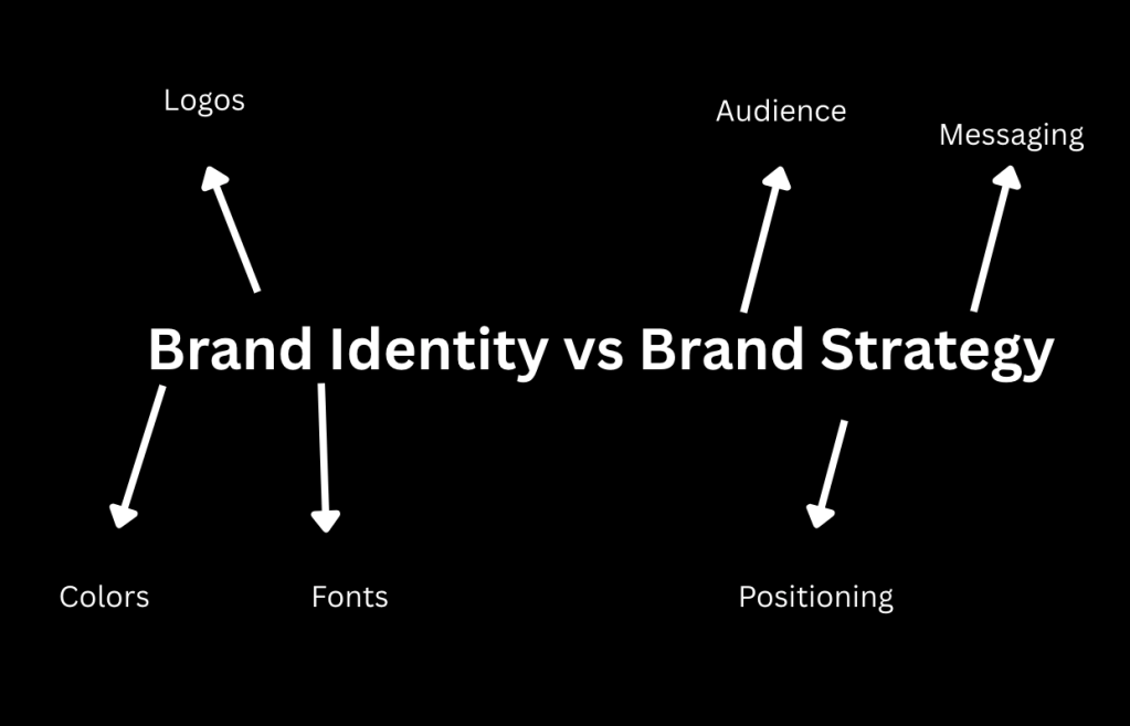
When people think about branding, they usually think about logos, colors, and aesthetics. Before this module, I did too. But after diving deeper into brand identity and brand strategy, I realized that strong branding is not just about how something looks; it’s about how it works, how it communicates, and how it builds trust.
This week completely shifted how I think about design, especially as someone interested in social media, marketing, and content creation.
Brand Strategy Comes First
One of the most important takeaways for me is that brand strategy always comes before brand identity.
Brand strategy is the foundation. It answers questions like:
Who is this brand for?
What does the audience care about?
What makes this brand different?
How should people feel when they interact with it?
Without answering these questions first, design decisions become random. A logo might look good, but it won’t mean anything.
When I was working on my RinaldiElectricbrandproposal, this became very clear. I couldn’t just jump into designing a logo. I had to first understand:
The audience (homeowners, business owners, EV customers)
What they value (trust, safety, professionalism)
How they choose an electrician
This made every design decision feel intentional instead of aesthetic.
Brand Identity is How Strategy Shows Up Visually
Once the strategy is clear, brand identity becomes the visual expression of it.
This includes:
Logo
Color palette
Typography
Photography
Tone of voice
What I found really interesting is how small visual choices can communicate big ideas.
For example:
Navy blue can signal trust and reliability
Yellow accents can represent safety and energy
Clean typography can make a brand feel more professional
These aren’t random choices; they are directly connected to how a brand wants to be perceived.
In my project, I focused on creating a visual identity that felt:
Clean
Modern
Trustworthy
Professional
Because that’s exactly what customers are looking for when hiring an electrician.
Trust is the Most Important Factor in Service Brands
Another idea that stood out to me is how much trust influences design, especially for service-based businesses.
Hiring an electrician isn’t a casual decision. People are letting someone into their home or business, which makes branding even more important. If a website looks outdated or unprofessional, it can immediately create doubt.
From my research and informal interviews, one thing kept coming up:
People trust brands that look polished and organized.
This made me realize that design is not just about creativity, it’s about reducing uncertainty.
Good branding answers unspoken questions like:
“Can I trust this company?”
“Do they know what they’re doing?”
“Will they do a good job?”
What This Means for Me as a Future Marketer
This module helped me see myself not just as someone who creates content, but as someone who builds brand experiences.
Going forward, I want to:
Be more intentional with design choices
Think about audience perception before aesthetics
Connect visuals back to strategy
Create content that builds trust, not just engagement
Whether I’m working on social media, a campaign, or a full brand, I now understand that everything should connect back to a bigger strategy.
Final Thought
Brand identity is what people see. Brand strategy is what makes them believe.
The strongest brands don’t just look good, they feel consistent, intentional, and trustworthy. And that starts long before the logo is ever designed.
TikTok has become one of the most powerful social media platforms for both content discovery and advertising. With millions of users scrolling through the app daily, the platform collects large amounts of user data to personalize content and improve ad targeting. While this data-driven system helps brands reach the right audiences, it also raises important questions about privacy and ethics in digital marketing.
According to TikTok’s privacy policy, the platform collects several types of information. This includes basic account details such as usernames, email addresses, and phone numbers. TikTok also gathers behavioral data, including the videos users watch, how long they watch them, what they like or share, and the searches they make. In addition, the platform collects device-related information such as IP addresses, device type, and approximate location data. This information helps TikTok personalize the “For You” page and allows advertisers to target audiences based on interests and behavior (TikTok Privacy Policy).
Privacy Concerns and Controversies
Although TikTok’s personalized content and advertising model has helped the platform grow quickly, it has also raised privacy concerns. In 2019, the U.S. Federal Trade Commission fined TikTok $5.7 million for illegally collecting personal data from children under the age of 13 without parental consent. This case highlighted the risks of collecting data from younger users on social media platforms (FTC).
More recently, TikTok has faced scrutiny from governments around the world regarding how user data is stored and accessed. Because TikTok is owned by the Chinese company ByteDance, some policymakers have expressed concerns about whether user data could potentially be accessed by foreign governments. Although TikTok states that it protects user data and has introduced new security measures, these concerns continue to spark debate about data privacy and platform accountability.
Transparency and Consumer Protections
Privacy laws such as the General Data Protection Regulation (GDPR) in Europe and the California Consumer Privacy Act (CCPA) in the United States aim to give users more control over how their personal data is used online. These regulations require companies to be transparent about their data collection practices and allow useers to request access to or deletion of their personal information.
TikTok states that users can download their data, control ad personalization settings, and adjust privacy options in their account settings. However, many privacy experts argue that these tools can still be difficult for average users to navigate.
This connects to ideas discussed in Faris Yakob’s Paid Attention, which explains that the platform itself shapes how advertising messages are delivered and perceived. Because platforms control the data used to target ads, they also hold significant responsibility for ensuring those practices remain ethical and transparent. In addition, Sharon Lee Thony’s The Marketing Campaign Playbook emphasizes that brands must adapt to evolving regulations and consumer expectations when using digital data for marketing.
How TikTok Could Improve Privcacy Practices
While TikTok has made efforts to address privacy concerns, there are several ways the platform could improve transparency and ethical advertising practices. One improvement would be simplifying privacy settings so users can more easily understand how their data is collected and used. Clearer explanations of how the advertising algorithm works could also increase transparency for users and advertisers.
Another improvement would be publishing more detailed transparency reports that explain how data is stored and protected. Independent audits could further strengthen user trust. As social media continues to play a major role in marketing, platfomrs like TikTok must balance the benefits of personalized advertising with stronger privacy protections.
Overall, TikTok demonstrates both the opportunities and challenges of data-driven marketing. Personalized content and advertising can create more relevant experiences for users, but maintaining trust requires ongoing improvements in transparency, privacy protections, and ethical data use.
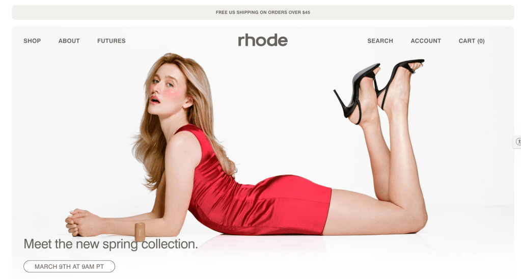
The Rhode Skin website serves as the brand’s primary digital platform for presenting skincare products and communicating its philosophy of simple, effective skincare routines. While the website reflects Rhode’s minimalist aesthetic and strong visual branding, user experience research reveals several opportunities to improve navigation, product discovery, and information clarity.
This semester-long usability project evaluated the Rhode website using multiple research methods to identify usability challenges and propose design improvements. The project demonstrates how UX research can be applied to analyze a real website, understand user behavior, and develop practical solutions that improve the overall digital experience.
The complete UX evaluation report can be viewed here:
The goal of this project was to evaluate how users interact with the Rhode Skin website and identify opportunities to improve usability while maintaining the brand’s clean and minimal visual identity.
The research focused on three key questions:
How easily can users navigate the Rhode website?
Can users quickly locate product information and ingredients?
Does the website structure support efficient product discovery?
To answer these questions, several UX research methods were applied throughout the semester.
These methods included:
Personas and scenarios
User interviews
Online surveys
Card sorting studies
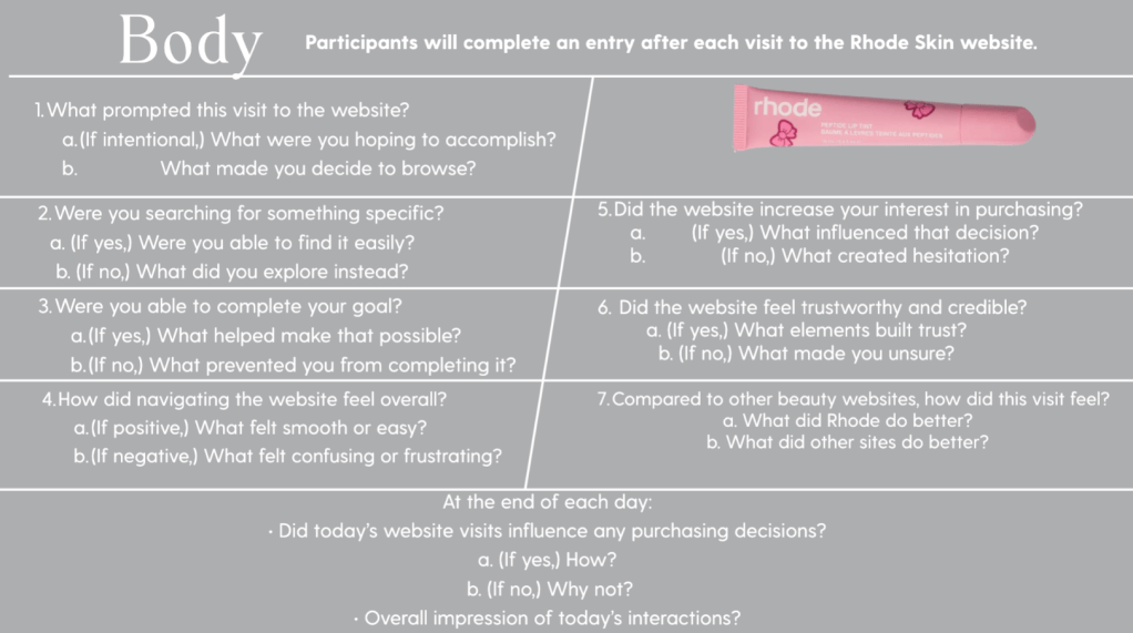
Diary studies
Heuristic evaluation
Usability testing
Using multiple research methods allowed usability findings to be validated across several different perspectives and user behaviors.
Website Overview
The Rhode Skin website functions primarily as an e-commerceplatform designed to promote and sell skincare products while communicating the brand’s philosophy of minimal skincare routines.
The website serves several important purposes:
Present Rhode’s skincare product line
Communicate brand identity and aesthetic
Educate consumers about ingredients and product usage
Facilitate online purchasing
The design emphasizes a clean interface, neutral color palette, and product-focused imagery that aligns with Rhode’s brand identity.
Research revealed that while the visual design is appealing, users sometimes experience difficulty locating product information quickly.
Target Audience
The Rhode website serves several different types of users with varying browsing behaviors and needs.
Social Media Influenced Consumers
Many users first discover Rhode products through platforms such as TikTok and Instagram. These users often rely on influencer recommendations and trend-driven skincare content when discovering new brands.
These users expect websites to provide clear product explanations and fast access to trending products.
Skincare Enthusiasts
Skincare enthusiasts tend to research ingredients and product effectiveness before making purchases. This group values transparency and detailed product information.
Websites that clearly explain ingredients, benefits, and routines tend to build higher trust among this audience.
Busy Professionals
Another important audience group includes busy consumers looking for efficient and straightforward skincare solutions.
These users prefer websites that allow quick browsing, easy navigation, and fast purchasing experiences.
Identified Website Issues
Initial evaluation of the Rhode website revealed several usability concerns.
Common challenges included:
Limited navigation categories
Minimal filtering options for products
Unclear grouping of skincare products
Additional scrolling required to locate product information
Mobile navigation requiring extra steps
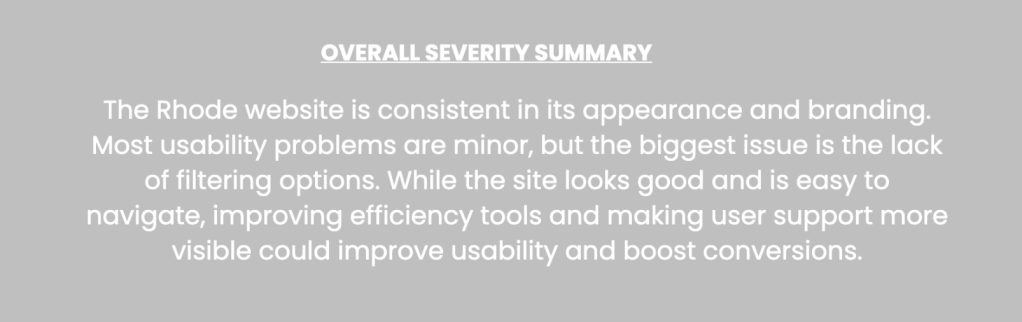
Although the website design is visually appealing, these issues can slow down the browsing experience and make it harder for users to quickly locate the information they need.
Competitor Analysis
To better understand how Rhode compares to other skincare brands, competitor websites were analyzed.
The competitors included:
Glossier
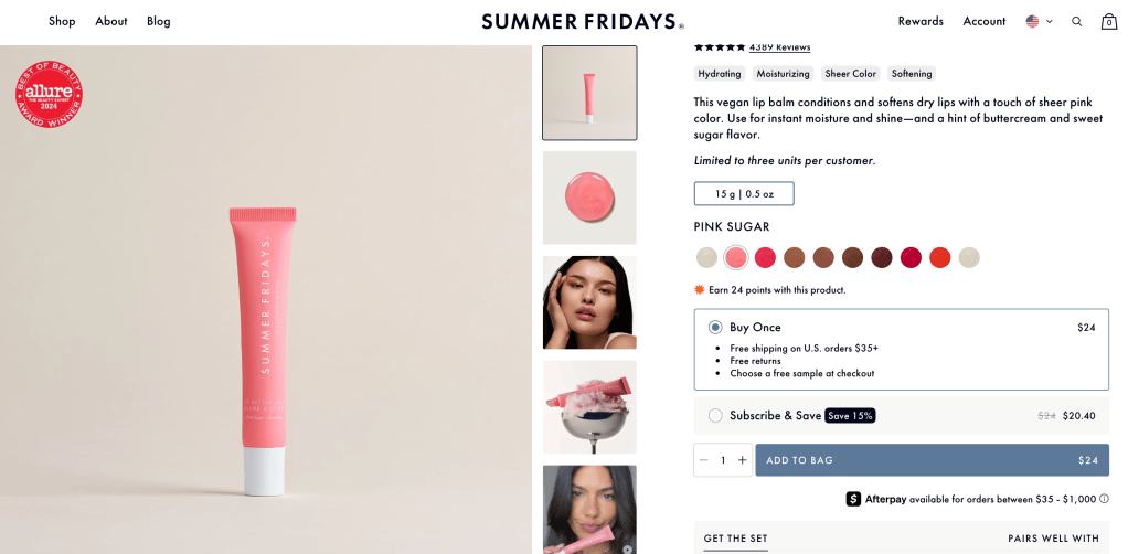
Summer Fridays
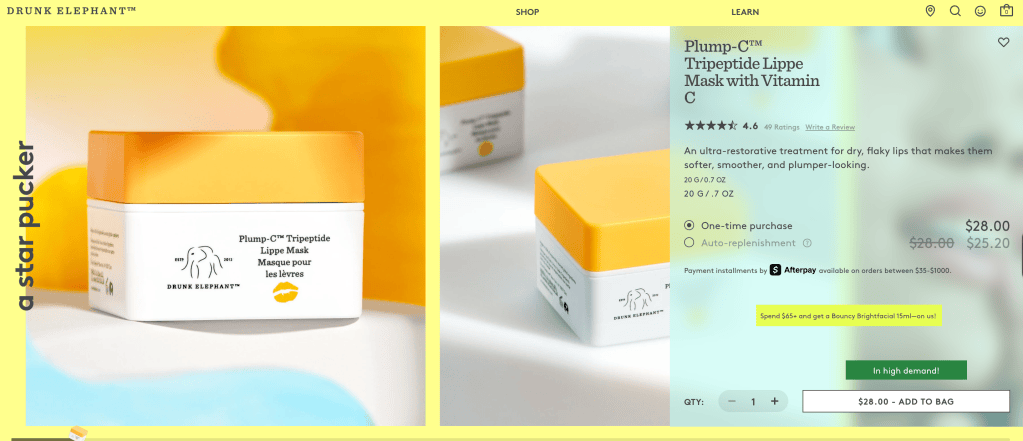
Drunk Elephant
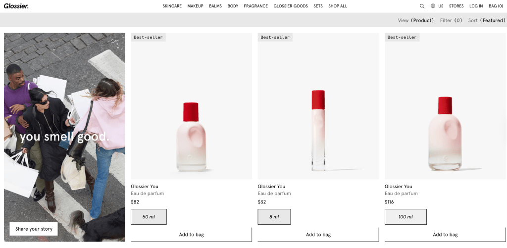
Glossier organizes its products by skincare routines and categories such as cleansers, moisturizers, and treatments. This structure helps users easily identify products that match their skincare needs.
Summer Fridays focuses heavily on ingredient education, offering detailed descriptions that help consumers understand how products work.
The competitor analysis revealed several design strategies that improve usability.
These strategies include:
Routine-based navigation
Product filtering options
Clear ingredient explanations
Structured product education
These insights helped guide the design recommendations for the Rhode website.
Personas and User Scenarios
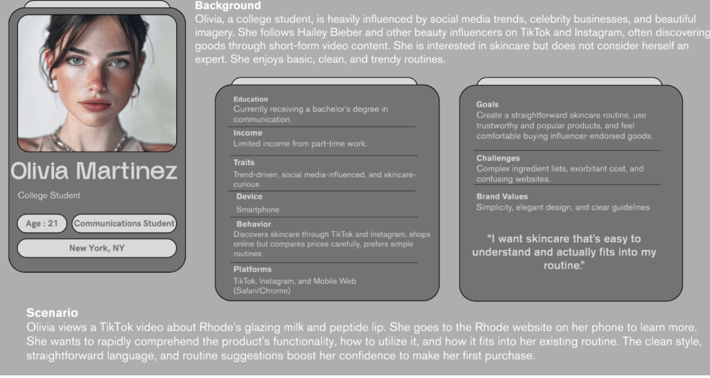
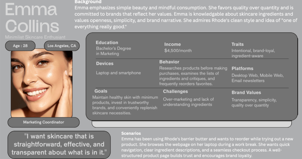
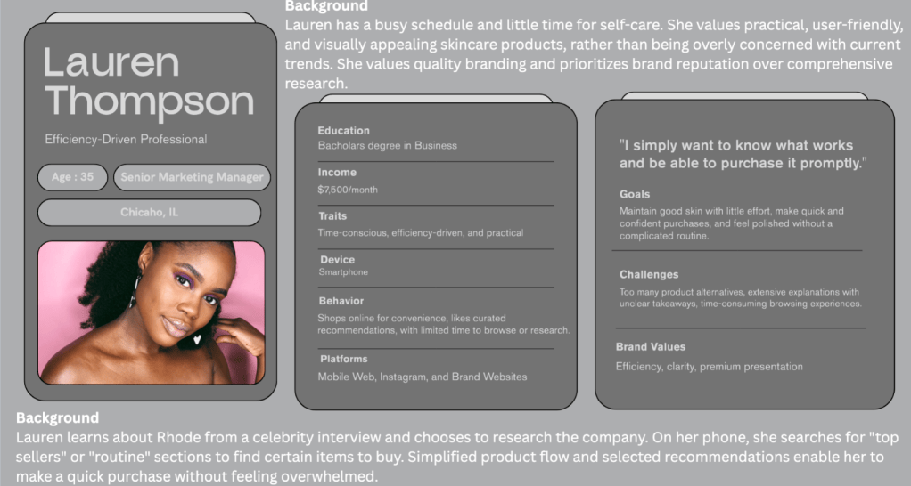
Personas were created to represent key audience segments interacting with the Rhode website.
Three personas were developed:
Olivia Martinez — College student influenced by social media skincare trends
Emma Collins — Skincare enthusiast focused on ingredient transparency
Lauren Thompson — Busy professional seeking efficient skincare solutions
These personas illustrate different user motivations, browsing behaviors, and expectations when interacting with skincare websites.
Using personas helped ensure that the usability analysis reflected realistic user needs.
Interview Study
User interviews were conducted to understand how individuals discover skincare products and interact with skincare websites.
Participants were asked questions related to:
Skincare habits
Product research behavior
Website navigation preferences
Interview findings revealed several consistent patterns:
Social media plays a major role in product discovery
Ingredient transparency increases user trust
Users prefer simple skincare routines
These insights helped clarify how users approach skincare websites and what information they prioritize when browsing products.
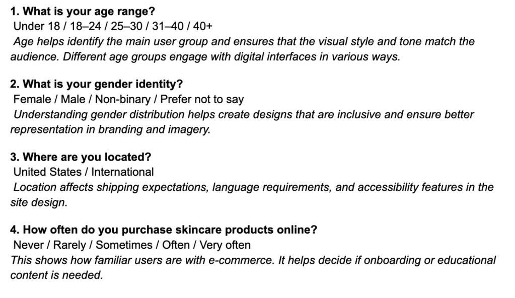
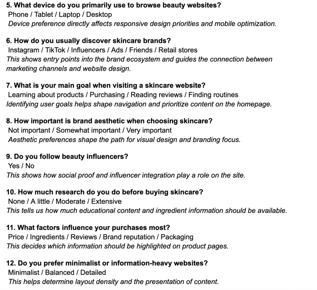
Survey Study
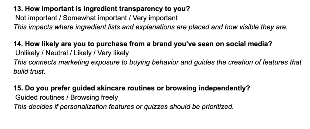
A survey containing 20 questions was distributed to collect broader feedback about skincare habits and website usability preferences.
The survey focused on three categories:
Demographic information
Skincare habits
Website usability preferences
Survey results showed that:
Most users browse skincare websites on mobile devices
These findings highlight the importance of clear navigation and accessible information in skincare e-commerce websites.
Card Sorting Study
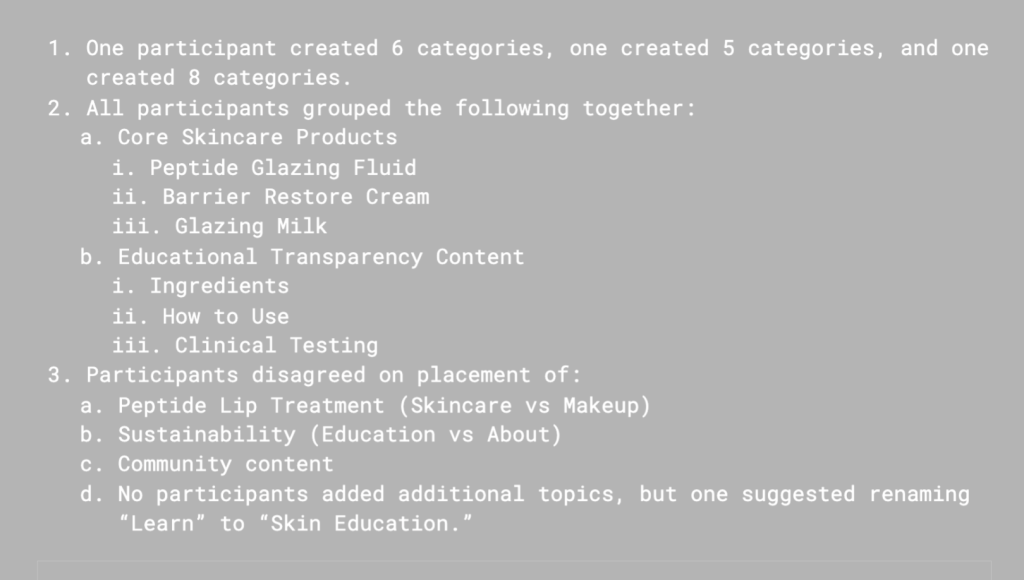
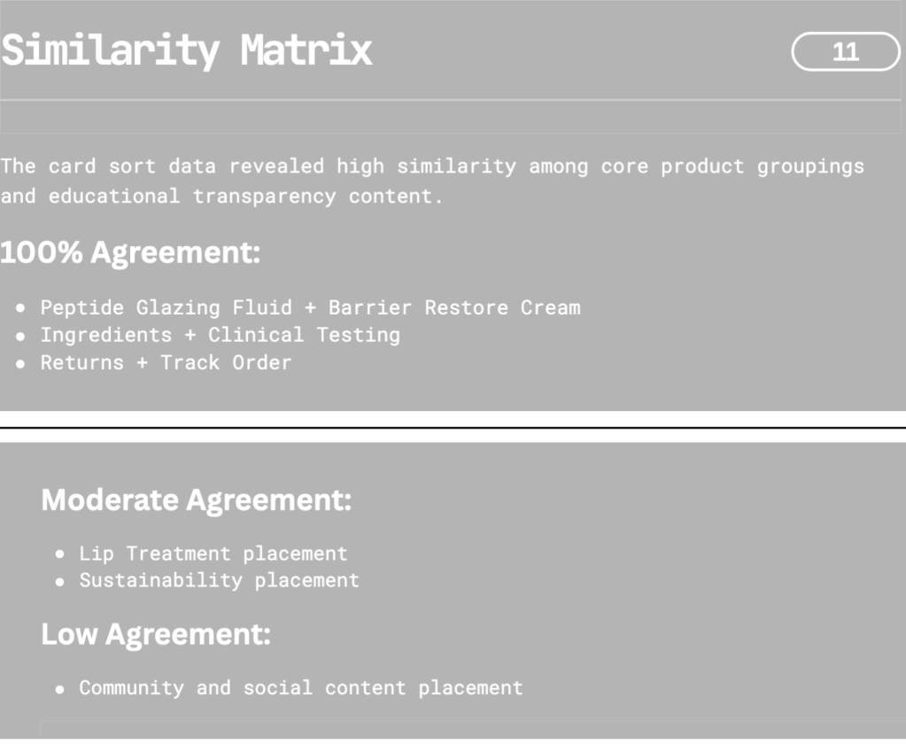
A hybrid card sorting study was conducted to understand how users mentally organize skincare content.
Participants sorted 30–40 cards representing website content into categories that made sense to them.
Participants commonly grouped products based on:
Skincare routines
Product types
Skincare concerns
This suggests that Rhode’s navigation structure could be improved by aligning website categories with how users naturally organize skincare information.
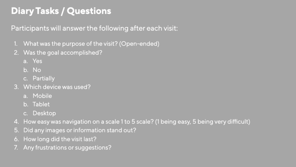
Diary Study
A diary study was used to observe how users interact with skincare websites over time.
Participants recorded their experiences researching skincare products and visiting brand websites.
Diary entries revealed that many users first discover skincare products through social media before visiting brand websites to learn more about ingredients and product benefits.
This reinforces the importance of clear product education and accessible information on brand websites.
Heuristic Evaluation
A heuristic evaluation was conducted using Nielsen’s usability principles to identify usability issues within the Rhode website.
Usability Testing
Usability testing was conducted with three participants who completed several tasks on the Rhode website.
Tasks included:
Locating a product
Identifying ingredient information
Learning how to use a product
Adding a product to the cart
Reviewing checkout steps
Most participants successfully completed the tasks, but some required additional navigation steps to locate product information.
This indicates that while the website is usable, improvements could streamline the browsing process.
Final Recommendations
Based on the research findings, several improvements are recommended to enhance the Rhode website’s usability.
Improve Navigation Structure
Navigation categories should be expanded and organized by skincare routines and product types to match user expectations.
Add Filtering Options
Filtering tools should allow users to quickly identify products based on skin concerns, ingredients, or product type.
Improve Product Education
Clear ingredient explanations and product usage guides should be incorporated to help users understand how products fit into their skincare routine.
Simplify Mobile Navigation
Since many users browse skincare websites on mobile devices, reducing scrolling and simplifying mobile navigation would improve usability.
Conclusion
This usability evaluation demonstrates how user experience research can uncover opportunities to improve digital product design.
The Rhode website successfully communicates the brand’s aesthetic and identity, but several usability improvements could enhance product discovery and navigation efficiency.
By implementing improved navigation structures, filtering tools, and product education features, the Rhode website could create a more intuitive and efficient browsing experience while maintaining its minimalist design.
When we discuss usability testing in theory, it seems simple: observe users, find problem areas, and give suggestions. However, running the sessions showed me how much user behavior differs from what we, as designers and strategists, expect.
For this project, I tested the Rhode Skin website to see how well users can complete key e-commerce tasks. My complete usability report includes the method, script, tasks, timing data, and suggestions. In this post, I will focus on what the sessions revealed and why it is important.
The Goal of the Study
The goal of this usability test was to observe real users as they navigated Rhode’s website and identify areas that affect clarity, trust, purchase confidence, and efficiency.
Three participants completed five structured tasks while using a think-aloud method. Each session lasted about 25 to 35 minutes and took place remotely via Zoom.
Before starting, participants were reminded, “We are testing the website, not you.” This helped make them more comfortable and honest in their feedback.
The Tasks
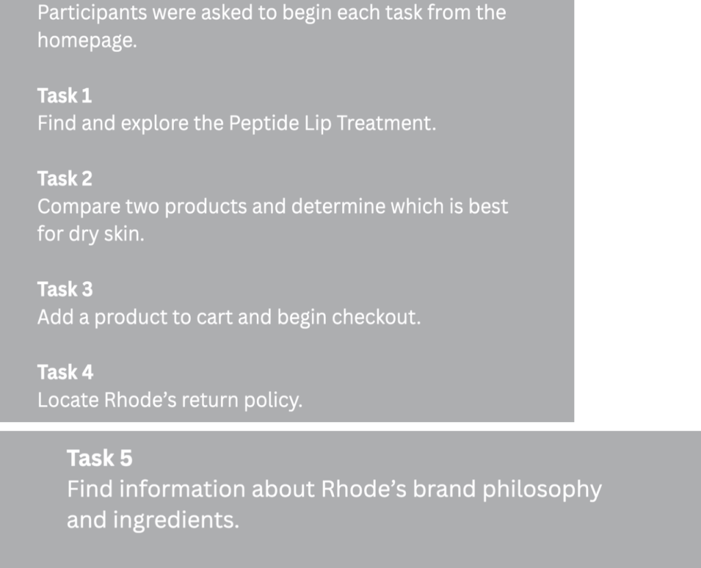
Participants were asked to:
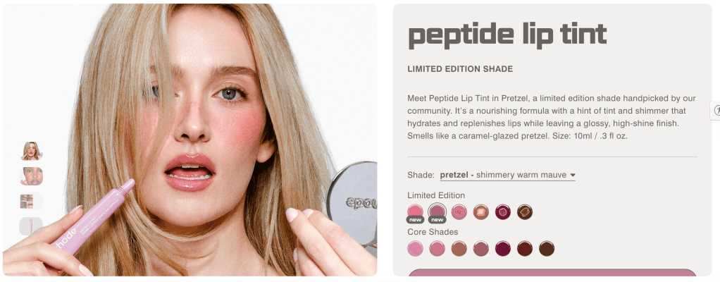
Find and explore the Peptide Lip Treatment
Compare two products for dry skin
Add a product to the cart and begin checkout
Locate the return policy
Find information about Rhode’s philosophy and ingredients
On paper, these tasks seem simple. In practice, they revealed important insights about usability.
What Worked Well
Product Discovery Was Strong
All participants quickly found the Peptide Lip Treatment. The homepage visuals and simple navigation helped support intuitive product discovery. This showed that Rhode’s design fits well with user expectations for a modern skincare brand.
Checkout Flow Was Smooth
Participants could add products to the cart and proceed to checkout without confusion. The flow felt clear and direct. However, some small hesitations arose when shipping costs were not immediately visible. While this didn’t stop task completion, it did affect purchase confidence.
Where Friction Appeared
Product Comparison Was Difficult
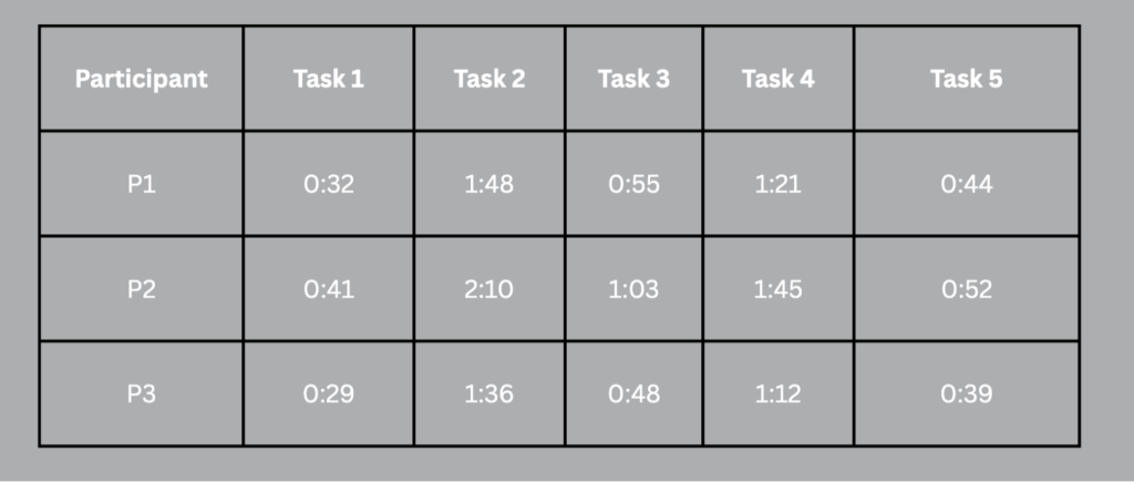
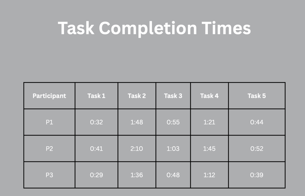
Task 2 took the longest on average. Participants had to switch between product pages to compare ingredients and benefits. One participant mentioned, “I wish I could see these next to each other.” This pointed out the lack of a comparison feature. While Rhode’s design is beautifully minimal, it forces users to mentally track differences rather than visually compare them.
The Return Policy Felt Hidden
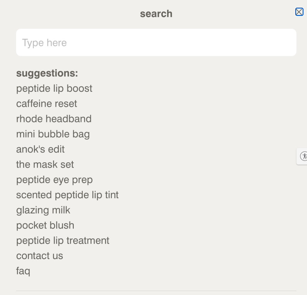
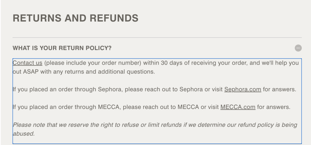
Two participants scrolled a lot before finding the return policy in the footer. One even used the browser search function. One participant stated, “I always check returns first. This feels hidden.” This was labeled a high-severity issue because clarity about returns directly affects trust and buying decisions.
Users Skim More Than They Read
One of my biggest takeaways from these sessions was how quickly users skim rather than read. Even in the brand philosophy and ingredient sections, participants scanned the text blocks rather than carefully reviewing them. Dense formatting slowed down comprehension. This reinforced what I’ve been noticing in digital behavior lately: clarity and structure are just as important as design.
Key Findings
From my analysis of the Rhode Skin Usability Test, the main usability issues were:
No side-by-side product comparison tool
Limited visibility of the return policy
Delayed shipping cost transparency
Text-heavy ingredient formatting
These aren’t major structural failures; they are small friction points. But these micro-friction points impact conversion psychology.
Embedded Session Excerpt
Below is a short excerpt from one of the usability sessions that shows the return policy search behavior and product comparison issues.
This clip illustrates how hesitation and scrolling behavior indicate uncertainty, even when users eventually succeed.
Visual Documentation
Here are screenshots from the testing process and the task timing table.
Final Reflection
Rhode Skin’s website shines in branding, visual design, and product discovery. However, this study highlighted that strong branding alone does not guarantee clarity. Minimal interfaces can unintentionally hide essential information.
Usability testing made one thing clear: Users do not navigate the way designers expect. They scan, hesitate, compare, and seek reassurance before committing.
Small improvements in visibility and comparison features could significantly boost user confidence and readiness to convert.
Conducting this study reminded me that usability testing is essential, not optional.
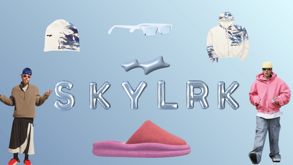
SKYLRK is Justin Bieber’s fashion brand. He officially launched it in July 2025. His brand includes hoodies, sunglasses, beanies, and shoes. SKYLRK represents elevated streetwear like oversized silhouettes, neutral palettes, and a laid-back but intentional aesthetic. Unlike fast-fashion influencer brands, SKYLRK leans into minimalism, exclusivity, and strong brand identity. Justin Bieber took everyday items and turned them into his own. The audience isn’t just buying clothes, they’re buying into a vibe.
SKYLRK’s core audience includes Gen Z and young Millennials (16-28), streetwear and celebrity-culture followers, TikTok fashion trend participants, and fans of elevated basics and oversized silhouettes. Since SKYLRK is celebrity-founded, influencer marketing must feel organic and not overly promotional. The strategy must balance exclusivity with accessibility.
Influencer Selection Process
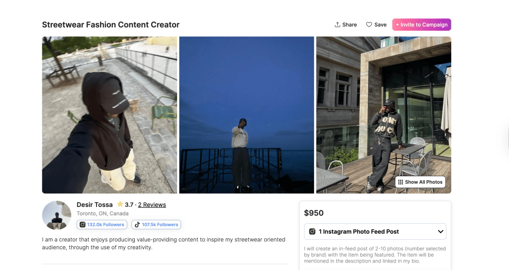
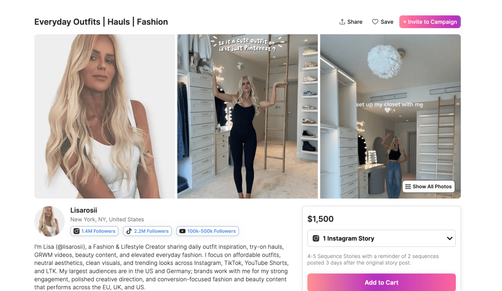
To find creators, I will use Collabstr. The goal is to find creators who already create fashion-forward content, have strong engagement rates, appeal to Gen Z streetwear, and feel authentic, not overly commercial.
Influencer 1: Male Streetwear Micro-Influencer
The first type of person is a male streetwear micro-influencer. Their follower range would be around 100K-300K, and their content would include outfit transitions, styling oversized pieces, and sneaker culture. A mid-tier male fashion styling SKYLRK hoodies or oversized pants would help normalize the brand in everyday styling, show versatility, and increase male audience reach. On Collabstr, for the category I put fashion, streetwear, mens fashion, outfit, minimalist fashion, aesthetic fashion, engagement rate 5%+, and location United States.
Influencer 2: Female Fashion Aesthetic Creator
The second type of influencer has a follower range of 300K-800K or more and posts content featuring “Model off-duty” looks, neutral aesthetic outfits, and minimalist streetwear. This works for SKYLRK’s brand because the neutral, oversized aesthetic aligns perfectly with the “clean girl” and streetwear crossover look currently trending on TikTok. This will expand SKYLRK’s appeal beyond Justin Bieber’s fan base and position the brand within everyday fashion culture.
Campaign Strategy
Campaign Goals
The first goal of the campaign strategy is to increase brand awareness. The target would be 3-5 million impressions across TikTok. Then, to boost engagement with the target 7% engagement rate, fashion content tends to perform strongly visually. Another goal is to drive conversions, targeting 8,000 tracked purchases through influencer links.
Type of Collaboration
This campaign would use sponsored TikTok styling videos, outfit transition content, affiliate links in the bio, and limited-drop early-access codes. Additionally, SKYLRK could extend the ambassadorship for 2 months with the highest-performing influencer. This created continuity instead of a one-time promotional spike.
Content Strategy
The content must feel aspirational but effortless. Some examples consist of “3 Ways to Style Skylrk Hoodie”, “Streetwear Fit Check”, outfit transitions from casual to elevated, and a day-in-the-life styling vlog. The main platform is TikTok, the next one would be Instagram Reels for cross-posting and product tagging. The key is that the influencer must style SKYLRK within their normal wardrobe and not make it look like an ad.
Performance Measurement and Tools Used to Track Success
The Key Performance Indicators (KPIs) include reach, impressions, engagement rate, shares and saves, link clicks, conversion rate, cost per acquisition, and lastly return on influencer investment. The tool that helps track success is TikTok Analytics. Which tracks average watch time, completion rate, and share rate. Instagram Insights tracks the saves, profile visits, and link clicks for the account. Affiliate Dashboard, which is code-based sales tracking and revenue attribution. HypeAudtor which helps track audience authenticity verification and post-campaign benchmarking.
By combining platform analytics with affiliate tracking, SKYLRK can directly connect influencer content to measurable revenue, which is essential for evaluating campaign ROI.
Challenges and Solutions
Challenge 1: Over-Reliance on Celebrity Name
Some consumers may only associate SKYLRK with Justin Bieber.
Solution
Partner with fashion-first influencers to shift perception from “celebrity merch” to “elevated streetwear.”
Challenge 2: Attribution Overlap
Consumers may see the product multiple times before purchasing.
Solution
What can help with this is having unique discount codes, UTM tracking, and post-purchase surveys.
Challenge 3: Trend Fatigue
Streetwear trends shift quickly at times.
Solution
Things that will avoid trend fatigue include rotating influencer aesthetic types, focusing on timeless silhouettes, and leveraging limited drops to create urgency.
Final Thoughts
SKYLRK’s influencer marketing strategy must feel intentional and culturally aligned. The goal is not just vulnerability; it is credibility within streetwear culture. By using Collabstr to select aligned creators and tracking performance through analytics dashboards and affiliate codes, SKYLRK can create influencer campaigns that are both aesthetic and data-driven.
For me, this strategy highlights how influencer marketing works best when it blends authenticity with measurable performance.
For this analysis, I chose Rhode, a direct-to-consumer skincare brand created by Hailey Bieber. Rhode is recognized for its simple product line, neutral look, and strong presence on Instagram and TikTok. The brand relies heavily on paid social media ads, especially during product launches and restocks. Since Rhode operates mainly online and competes in a tough beauty market, audience segmentation is essential to ensure its ads target the right consumers.
Rhode’s Target Audience
Rhode’s target audience mainly includes Gen Z and young Millennial women aged 18 to 34. These consumers are very active on social media, especially Instagram and TikTok. They are comfortable shopping online and are influenced by beauty creators and brands started by celebrities.
Demographically, the audience typically lives in urban or suburban areas across the United States, particularly in major cities such as New York, Los Angeles, and Miami. Behaviorally, they often engage with skincare content, follow influencers who showcase “clean girl” or dewy makeup styles, and shop at retailers like Sephora. Their interests cover skincare routines, wellness trends, minimal beauty looks, and viral product launches.
Segmentation allows Rhode to move beyond basic demographic targeting. Instead of just targeting “women interested in beauty,” the brand can focus on users who have recently watched skincare tutorials, visited beauty websites, or engaged with influencer content. This kind of segmentation helps Rhode connect with consumers who are ready to buy, making ad spending more effective and messaging more relevant.
How Rhode Uses Custom Audiences
Custom Audiences play a key role in Rhode’s paid strategy. A Custom Audience is created from first-party data, which includes people who have interacted with the brand. Rhode can make Custom Audiences using data from website visitors collected through tracking pixels, past buyers, email subscribers, or users who engage with the brand on Instagram and TikTok.
For instance, if someone visits Rhode’s website and views the Peptide Lip Treatment but doesn’t complete their purchase, the brand can retarget them with a reminder ad. This ad could include user-generated content, a tutorial, or information about a limited restock. Since the consumer has already shown interest, the conversion rate is much higher.
A real-world example of effective segmentation is Glossier, which uses retargeting ads that feature customer reviews and social proof to encourage users to complete their purchases. By focusing on warm audiences, Glossier boosted conversions and built customer loyalty. Rhode uses a similar strategy, especially during popular product releases. Custom Audiences enable the brand to retarget users who have abandoned their carts, previously bought products, or frequently engage with social media content. This ultimately increases conversion rates and return on ad spend.
Expanding Reach with Lookalike Audiences
Custom Audiences help Rhode retarget current users, while Lookalike Audiences help the brand grow. A Lookalike Audience lets platforms like Meta look at a high-value customer group and find new users with similar traits.
For Rhode, a good source audience would likely include repeat buyers, high-spending customers, or users who made a purchase in the last 90 days. These people show strong brand loyalty and a high intention to buy. Once this audience is uploaded or identified on the platform, Meta can create a Lookalike Audience of new users who share the same demographics, behaviors, and interests as those customers.
This strategy lets Rhode broaden its reach without losing quality. Instead of targeting a wide range of beauty interests, the brand can focus on new consumers who resemble its best customers. This approach keeps acquisition costs lower while ensuring strong engagement and conversion rates.
Why Audience Segmentation Matters
Audience segmentation is essential for paid social media success. Without segmentation, brands risk wasting budget on users who are unlikely to convert. Costs increase, engagement drops, and ads feel irrelevant. With proper segmentation, however, messaging becomes personalized, creative aligns with user intent, and campaigns perform more efficiently.
Rhode demonstrates how combining clear target demographics, Custom Audiences, and Lookalike Audiences creates a strategic paid ecosystem. By reaching the right audience at the right time, whether through retargeting warm leads or expanding to high-quality new prospects, Rhode maximizes both conversions and long-term growth.
In a competitive beauty market, success is not just about having a great product. It is about understanding your audience deeply and using data-driven segmentation to turn interest into action.
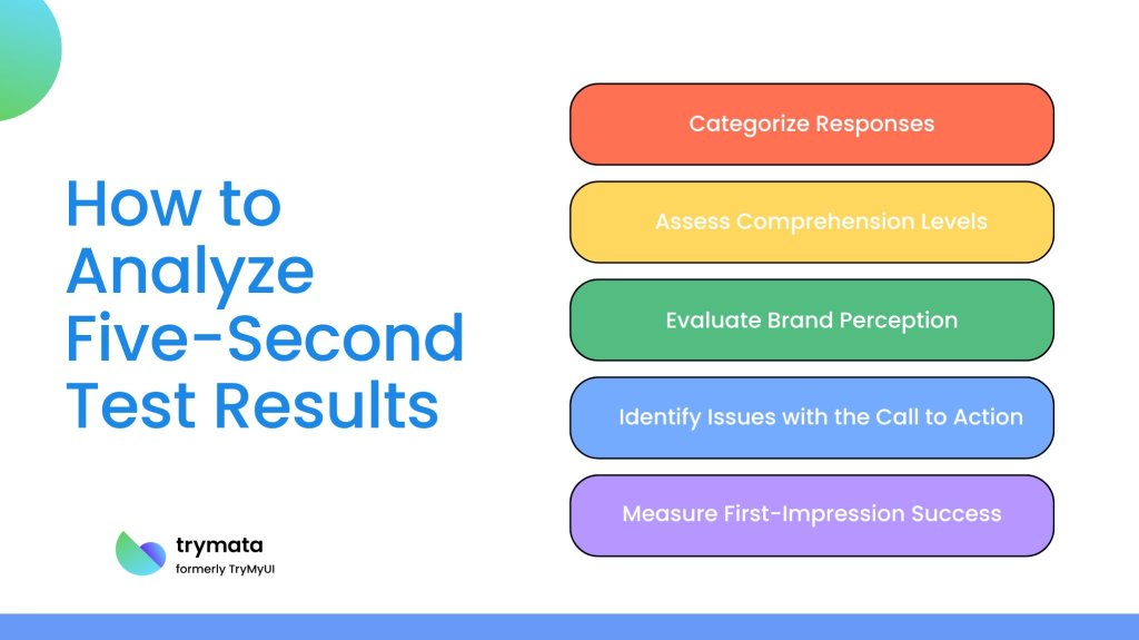
When people visit a website, they don’t read everything. They scan. Most users decide if they understand a page in just a few seconds. The Five Seconds Test is a UX method that measures that moment: what a user remembers after a quick first impression.
This method focuses on clarity, visual hierarchy, and whether the main message of a design is understood right away.
What is a Five-Second Test?
A Five-Second Test presents a design to participants for exactly five seconds. After the screen disappears, participants answer questions about what they remember.
The goal is not memorization, it’s understanding. If users cannot explain what the page was about after five seconds, the design probably isn’t communicating clearly.
This method is often used to test:
landing pages
app onboarding screens
product pages
advertisements
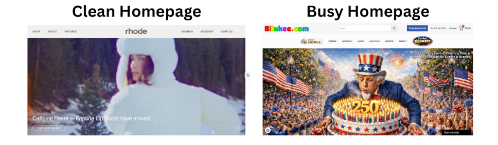
homepage layouts
How the Five-Second Test Works
The process is simple but organized:
Show a participant a screen for five seconds
Hide the screen
Ask recall questions
Record answers
Repeat this with multiple users
The main questions typically include:
What was this page about?
What stood out the most?
What action were you supposed to take?
What do you remember visually?
Patterns in responses show whether the design communicates its intent quickly.
Tools Used for a Five Seconds Test
Test Several digital tools make this method easy to run:
UsabilityHub is built specifically for quick perception tests.
Maze, which supports remote UX testing.
Lookback, which records user reactions.
Google Forms plus screen share, a simple DIY option.
Research Examples Using the Five-Second Test
Study 1: Landing Page Clarity
A marketing research group tested different homepage layouts for an e-commerce brand. Participants remembered the hero image but often forgot the value proposition. The designers moved the headline above the image, resulting in an increase in conversions. The test showed that visual focus was more important than messaging placement.
A mobile app company tested onboarding screens with a Five Seconds Test. Users recalled the decorative illustrations but overlooked the instructions. The redesign simplified the visuals and improved the retention of key onboarding steps.
A nonprofit organization conducted the test to see if visitors understood their mission. Most participants could describe the visuals but struggled to explain the organization’s purpose. After adjusting the typography and messaging hierarchy, comprehension improved significantly.
The Five Seconds Test highlights a simple truth: users don’t study websites, they glance at them.
If a design fails to communicate instantly, it risks losing attention. This method forces designers to focus on clarity instead of decoration and makes sure that the most important information stands out.
It’s quick, cheap, and surprisingly revealing.
Final Thoughts
The Five Seconds Test is powerful because of its straightforward honesty. It eliminates guesswork and reveals whether a design actually works in practice. In a world where attention spans are short and competition is fierce, those first five seconds can decide if a user stays or goes.
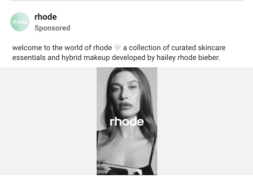
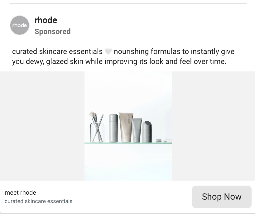
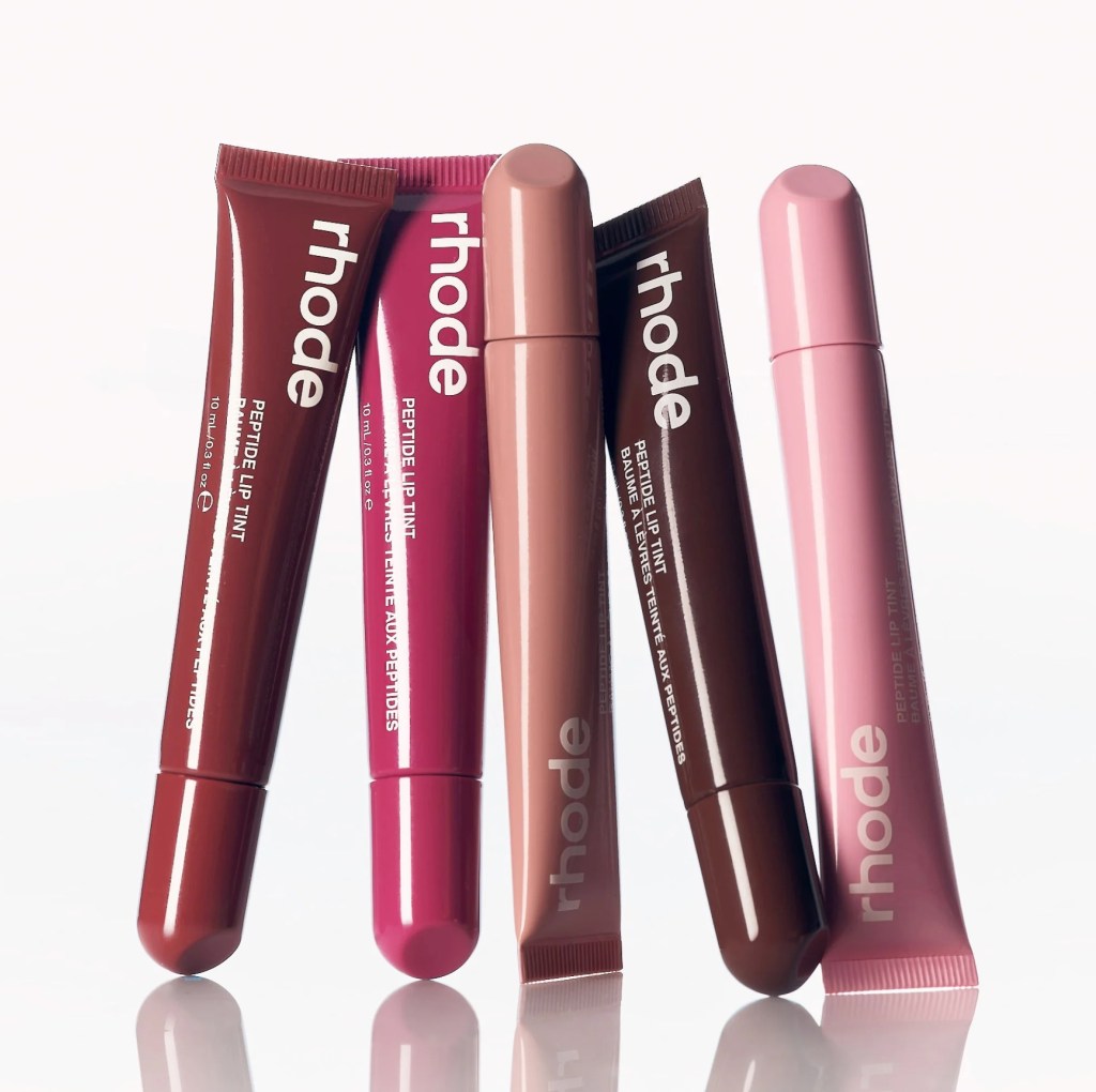
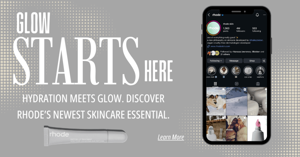
Rhode Skin’s paid social advertising focuses on beauty campaigns that drive conversions. The ad highlights Rhode’s Peptide Lip Treatment and aims to encourage viewers to go from knowing about the product to buying it. The main goal of the campaign is to drive conversions. The ad stresses product benefits, immediate availability, and a clear call to action for purchase.
The creative strategy matches Rhode’s brand identity. It features a clean look, neutral colors, and close-up product images that convey a premium skincare feel. The copy is clear and focused on benefits, emphasizing hydration and everyday use rather than aggressive sales language. This approach aligns with beauty industry trends that value authenticity and lifestyle integration over direct selling. The ad format is well-suited to short, vertical viewing, which aligns with how people use TikTok and Instagram Reels. The Call-To-Action (CTA) prompts immediate purchase, indicating that the campaign focuses more on driving sales than raising awareness.
Target Audience Assumptions
Rhode’s audience is likely young adults aged 18 to 34 who are interested in beauty and follow skincare influencers and minimalist brands. The ad assumes that viewers know about Rhode’s founder and trust the brand. This suggests that targeting focuses on lookalike audiences and retargeting groups, which indicates a strategy aimed at engaging warm audiences rather than broad prospecting. Industry data from WordStream indicates that average beauty-industry Facebook ads achieve click-through rates of approximately 1.2%- 1.6% and cost per click between $0.70 and $1.20. Given Rhode’s strong brand recognition and visually appealing ads, it is reasonable to expect that its ads perform at or above these benchmark levels.
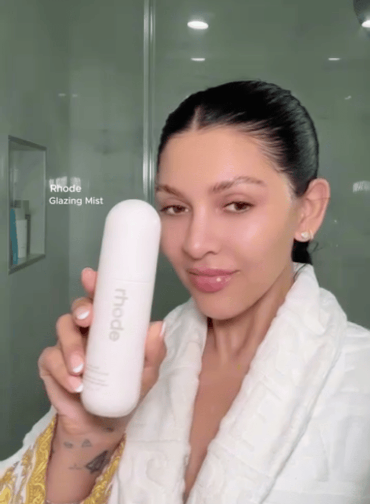
First, Rhode could use A/B testing with variations that feature user-generated content. Beauty audiences often trust peer demonstrations more than studio shots. A split test that compares influencer-style tutorials with polished product shots could increase engagement and CTR. Second, Rhode could try dynamic retargeting ads that display recently viewed products. This reinforces purchase intent and can lower CPA by reminding interested users to complete the purchase. Finally, testing a soft educational CTA, such as “See why it sells out,” could boost curiosity-driven clicks while maintaining a premium brand tone.
Conclusion
Rhode’s ad is clearly focused on getting conversions and performs well compared to other beauty ads. However, small improvements through A/B testing, better targeting, and creative changes could further increase efficiency. Success in paid social rarely comes from big changes; it relies on careful optimization based on audience behavior and performance data.
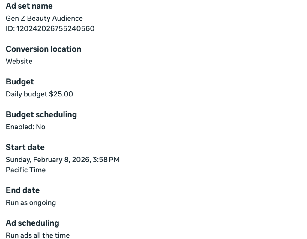
This mock paid social media campaign was created using Facebook Ads Manager to simulate a real advertising strategy for Rhode Skin, a skincare brand known for its simple aesthetic and strong presence on social media. The purpose of this campaign is to show how a business would set up a paid social strategy, define clear goals, identify a target audience, choose placements, and assess success metrics. This simulation reflects real digital marketing practices used by beauty brands targeting Gen Z and young millennial consumers who engage a lot with Instagram-based skincare content.
Campaign Objective
The main aim of this campaign is conversions. We want to direct users to Rhode Skin’s website and motivate them to buy products. This focus on conversions matches Rhode’s direct-to-consumer model, where online sales and measurable digital results are essential.
To boost website traffic and product visibility, we set a performance goal to maximize landing page views.
This goal helps increase short-term sales and improve long-term brand visibility. It directs interested users straight to Rhode’s digital storefront.
Target Audience Strategy
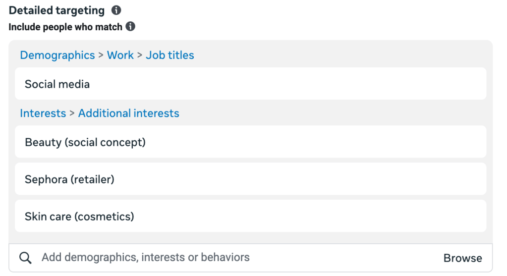
The campaign focuses on young beauty consumers who follow skincare trends and brands promoted by influencers.
Demographics
Location: United States
Age: 18–30
Gender: Women
Interests
Skincare
Social Media
Rhode Skin
Beauty
Behaviors
Engaged online shoppers
Frequent social media users
This audience represents Rhode’s main customers: digitally engaged women who care about aesthetic branding, skincare education, and influencer culture. By focusing on this specific group, advertising dollars will reach those consumers who are most likely to make a purchase.
Ad Placement
Manual placements were chosen to focus on the platforms where Rhode’s audience is most active.
Selected placements include:
Instagram Feed
Instagram Stories
Instagram Reels
Facebook Feeds
Facebook Stories
Instagram placements are important because beauty content does best on visual-first platforms. Reels and Stories let the brand fit naturally into daily scrolling. This boosts ad engagement and helps people remember the brand.
Budget Strategy
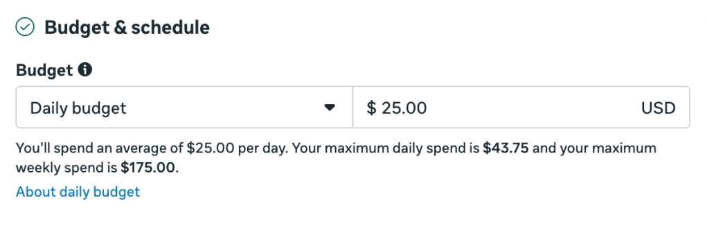
A simulated daily budget of $25 was set for a small-scale test campaign. This budget represents how brands usually test ad creatives before expanding.
The test budget includes:
Tracking performance
Optimizing the audience
Evaluating cost-per-click
Testing creative content
This setup supports safe paid media experiments.
Ad Creative and Messaging
The message is simple, inspiring, and centered on the product. It reflects Rhode’s clean look while highlighting hydration and glow, which are two important skincare factors for Gen Z consumers.
Success Metrics
Campaign success would be measured using common paid media metrics.
Cost Per Click (CPC) Measures traffic efficiency.
Target benchmark: $0.50, $1.20
Click-Through Rate (CTR)
Measures engagement and ad relevance.
Target benchmark:1.5% – 3%
Cost Per Thousand Impressions (CPM)
Measures awareness efficiency.
Target benchmark: $8 – $15
Conversion Rate
Measures how many clicks result in purchases.
Target benchmark: 2% – 5%
Return on Ad Spend (ROAS)
Measures revenue relative to ad spend.
Target benchmark: 3:1 or higher
These metrics provide a balanced view of engagement, awareness, and financial performance.
Expected Outcomes
If successful, this campaign would:
Increase Rhode’s website traffic.
Drive measurable product purchases.
Strengthen brand visibility.
Build audience data for future retargeting.
Improve ad optimization through performance insights.
This shows how modern beauty brands mix creative storytelling with data-driven marketing.
Conclusion
This mock campaign shows the complete structure of a paid social media strategy using Facebook Ads Manager. It covers everything from choosing objectives to targeting audiences and measuring performance. The campaign illustrates effective digital advertising practices. By matching creative messaging with data-driven metrics, the Rhode Skin simulation demonstrates how brands use paid social platforms to boost both conversions and brand growth in a competitive digital space.
One common misunderstanding about design is the idea that there is a clear endpoint. When something looks polished, has a successful launch, or receives positive feedback, it is often seen as complete. Iterative design challenges this view. Instead of seeing design as a one-time goal, it views it as an ongoing process that grows through testing, collecting feedback, and making improvements.
What stood out to me about iterative design is how closely it matches real human behavior. Users don’t always interact with products in predictable or perfect ways, and designers don’t always get it right on their first try. Iterative design recognizes this by allowing for learning, adjustment, and growth, which is essential in user-focused design.
What Iterative Design Looks Like in Practice
At its core, iterative design means creating a product, observing how users interact with it, and then improving it based on real feedback. Rather than waiting for a “final” version, designers release early versions, evaluate them, and make changes as they learn more about user needs and behaviors.
This method reduces the chances of creating products based on guesswork. Instead of assuming user preferences, iterative design allows designers to see what really works. Even small changes, like moving button locations, simplifying navigation, or changing instructions, can significantly improve usability when informed by testing.
Iterative design also shifts the focus from achieving perfection to making progress. A design does not have to be perfect to be effective; it just needs to be open to improvements.
An Example of Iterative Design
An example of iterative design can be seen in social media platforms like Instagram. Over the years, Instagram has regularly changed its layout, features, and navigation based on how users interact with the app. While some changes may confuse users at first, many updates are refined through revisions that consider user behavior and feedback.
These changes highlight an important point. Iterative design does not aim to avoid mistakes; it focuses on learning from them. Functions that do not perform well are either improved or removed, while effective patterns are strengthened. This method demonstrates a commitment to evolving alongside users, rather than expecting them to adapt instantly to every change.
Another clear example of iterative design is seen in TikTok’s ongoing changes to its interface based on user interactions. Features like the placement of the For You page, editing tools, and creator analytics have evolved over time due to real user engagement with the app. These changes are intentional, coming from regular observation and improvement. Instead of assuming the first version is flawless, TikTok sees the platform as something that can always be better. This shows that iteration is not just about fixing errors; it’s about responding to real usage trends.
Role of User Research in Iterative Design
The importance of user research in iterative design is vital. Without research, iteration becomes simple guesswork. Techniques such as usability testing, interviews, and observation help designers spot user difficulties, figure out what is intuitive, and identify areas that need improvement.
I found it important that research should happen during the design phase, not just at the start. Iterative design relies on regular feedback. This allows designers to test their assumptions and confirm their choices at different stages. It ensures that changes are based on real user behavior rather than personal opinions.
By involving users continuously throughout the process, iterative design keeps the focus on the people using the product.
Where Iterative Design Can Break Down
Although iterative design looks ideal in theory, it can be hard to apply in real life. Factors like tight timelines, business demands, and stakeholder expectations may push teams to rush to a “final” product. When under pressure, iteration can seem wasteful or unnecessary, especially with tight deadlines.
However, skipping iteration often leads to bigger problems later. Designs that don’t undergo thorough testing can cause usability issues, increased support needs, and costly redesigns. To implement iterative design successfully, you need support from stakeholders who understand that gradual improvements over time lead to better results in the long run.
Iterative design focuses on a key idea, which is putting users first and meeting their needs. It acknowledges that users’ expectations change and that design should evolve with them.
This approach also encourages flexibility. Designers are not limited by early decisions and can adjust their methods based on new insights. Iterative design allows products to grow in a natural way, improving usability, accessibility, and overall satisfaction over time.
Progress Over Perfection
Iterative design shows us that effective design is always changing. It improves through feedback, assessment, and a willingness to change. Instead of aiming for perfect results right away, iterative design focuses on growth and flexibility.
For me, this concept highlights the importance of being open to feedback and recognizing that design is a conversation between users and creators. By using an iterative approach, designers create experiences that feel more thoughtful, intuitive, and human, which is exactly what user-centered design seeks to achieve. Iterative design focuses on users. It highlights the importance of feedback and ongoing improvement rather than seeking perfection.